Intricate
repetition.

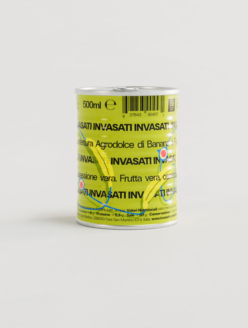
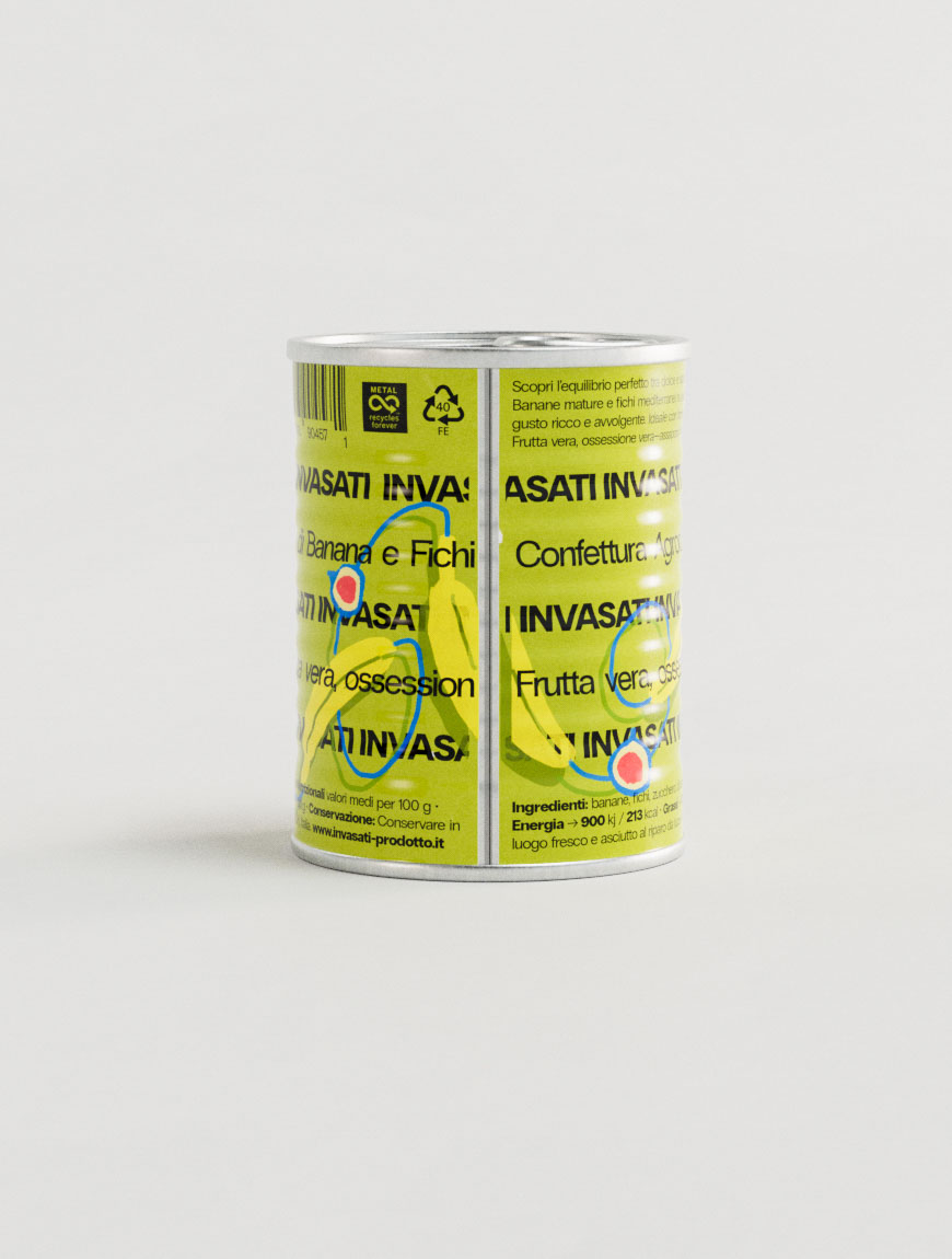
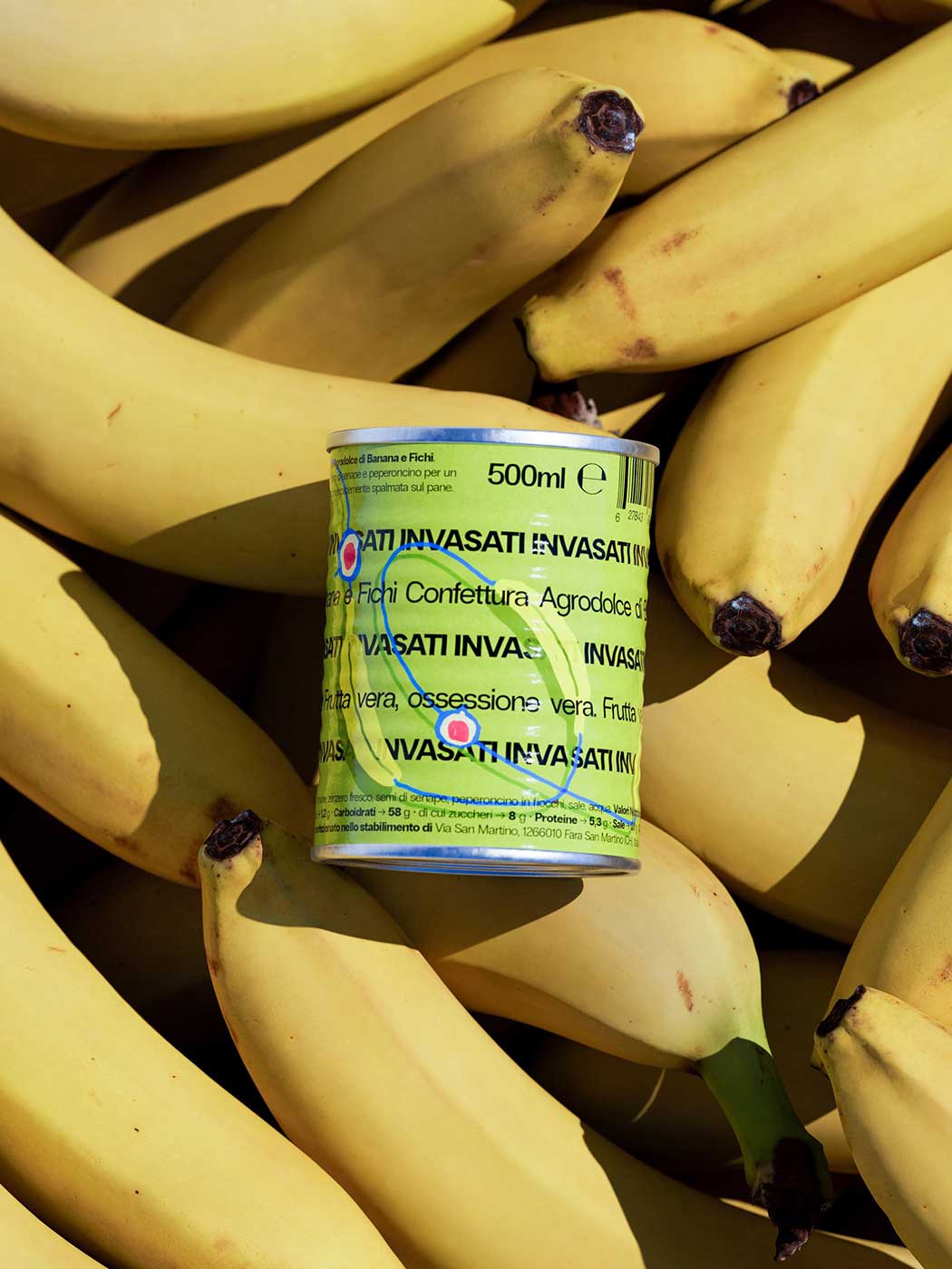
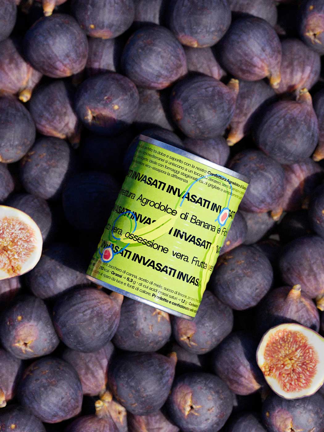
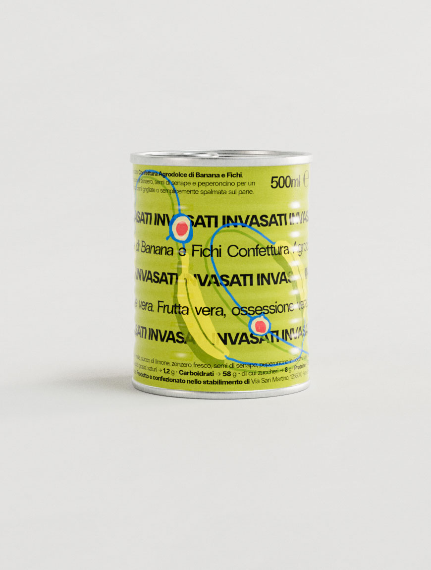
The photograph presents a meticulously ordered wall of slim aluminium cans, each wrapped in a crisp white label dominated by elegant black serif typography spelling “VASATI”. A chartreuse block illustration of a segmented banana slices horizontally across every label, injecting energy and creating a repeating rhythm that underscores the packaging design agency’s emphasis on clarity and shelf impact. The cans are stacked in precise columns on a cool grey surface, their collective pattern becoming a graphic-design grid that signals disciplined art direction. Mid-centre, a ripe fig is wedged between rows, its ruby seeds and ochre flesh disrupting the uniformity and hinting at the fruit purée within—an identity design flourish that adds narrative without clutter. In the foreground a gently speckled banana arcs across the frame, grounding the scene with tactile authenticity that a branding studio might use to signal freshness. Diffuse overhead lighting produces soft, studio-grade shadows, ensuring every barcode, recycling icon and 500 ml detail remains legible while the deep teal backdrop recedes, keeping focus on the product. The composition exemplifies contemporary creative direction where minimal packaging design meets expressive storytelling, demonstrating how a design agency can balance precision with emotive cues to elevate everyday grocery items

Tinned Jam packaging design
Italy, 2025

Adorable
authenticity.

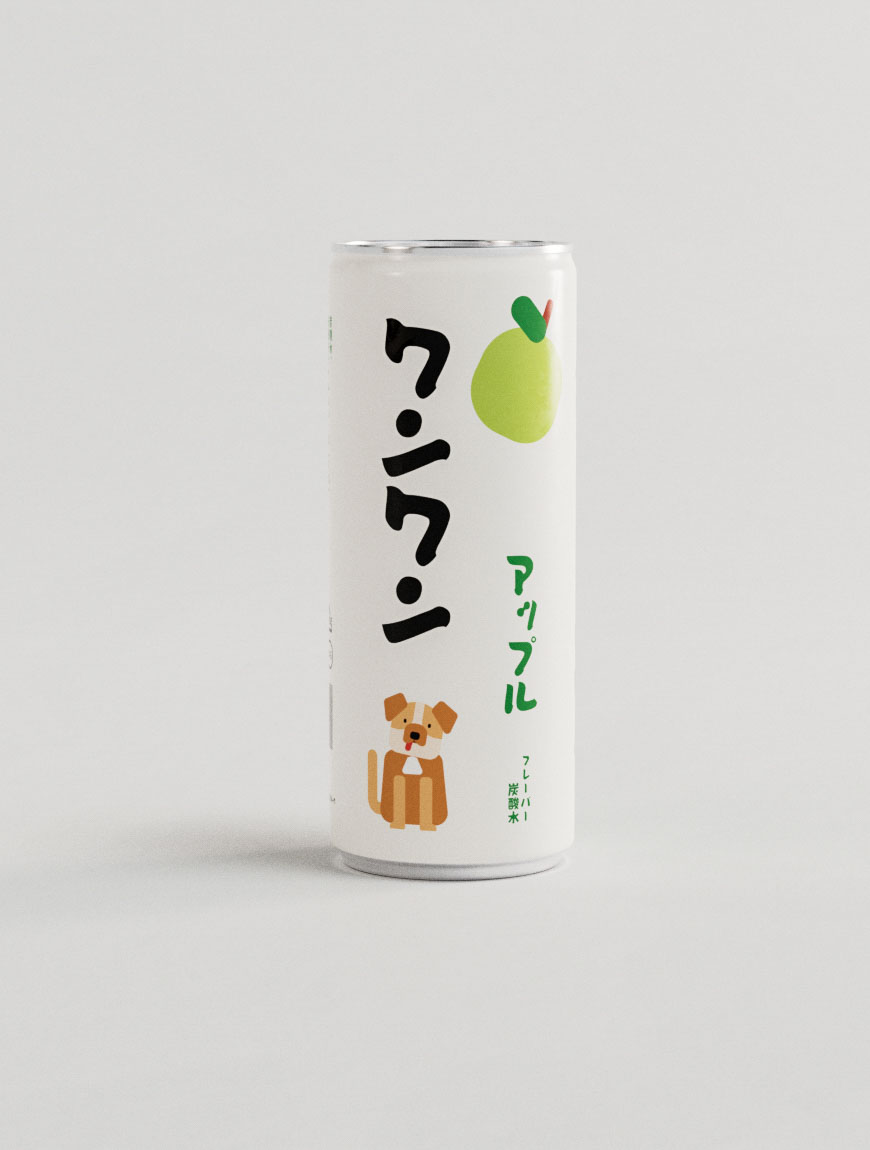
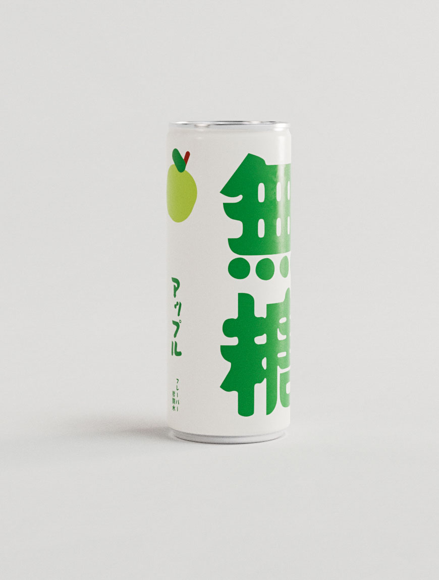
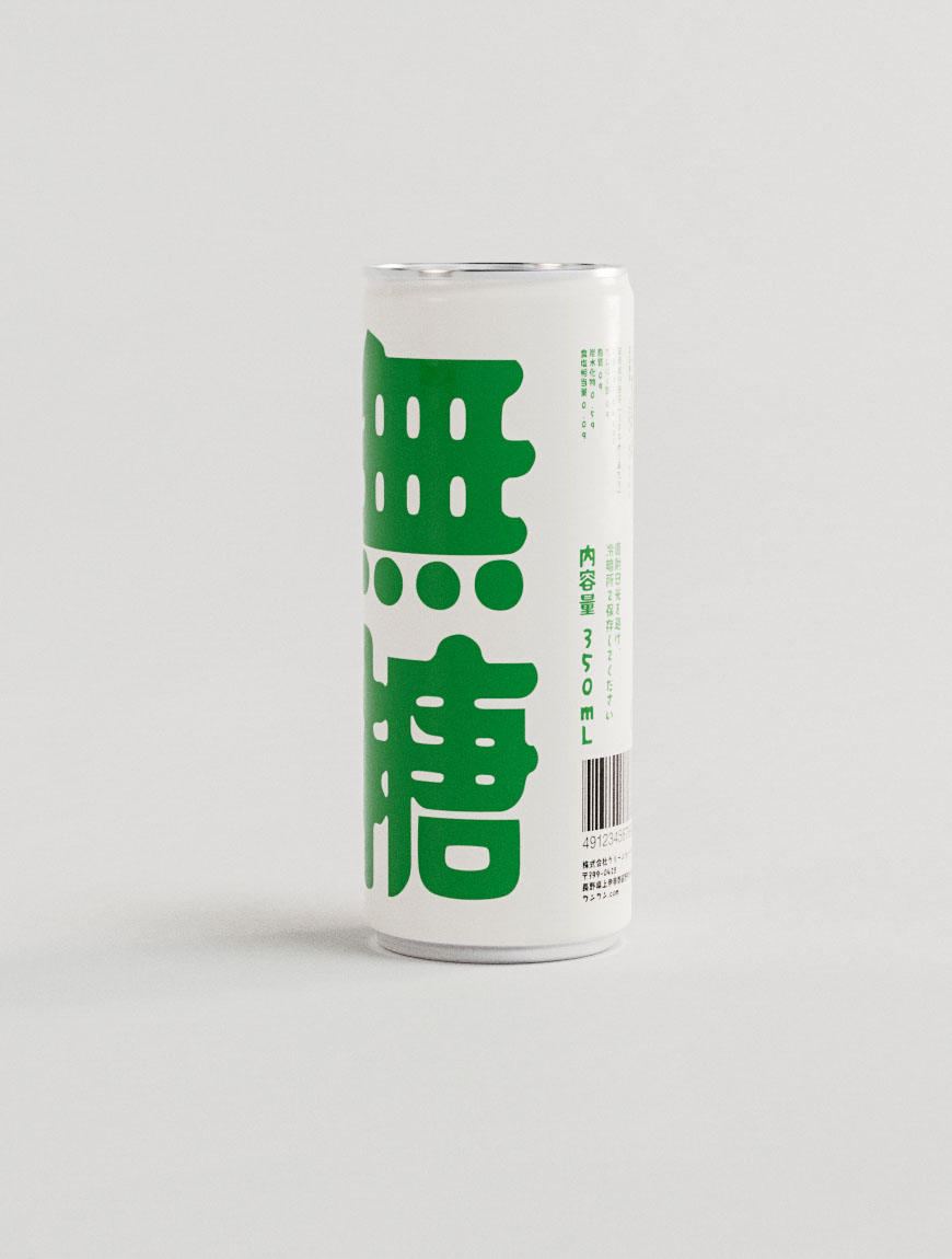
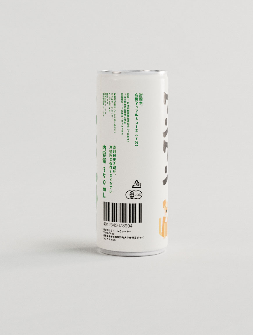
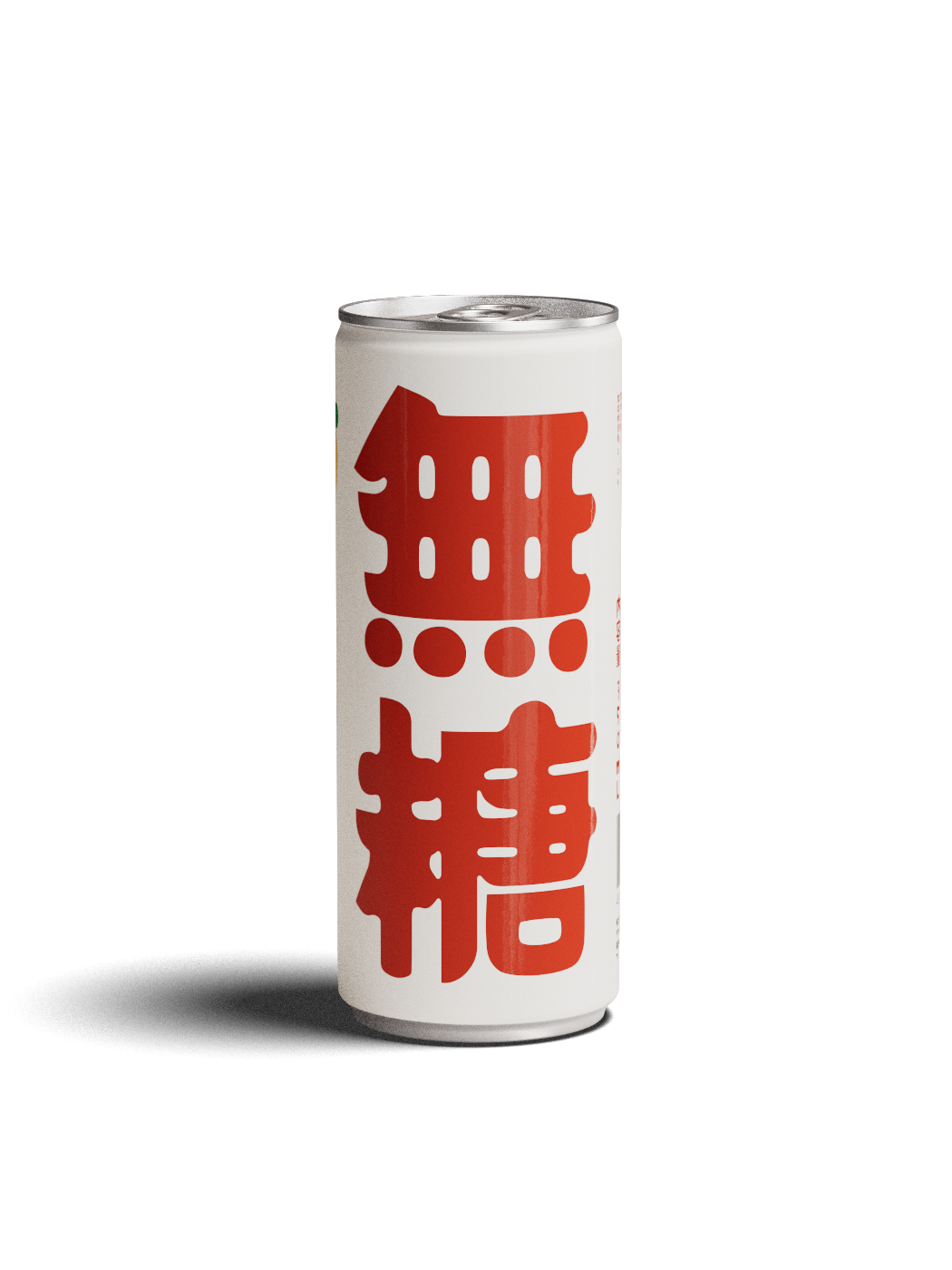
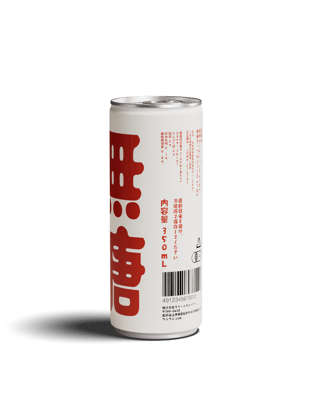
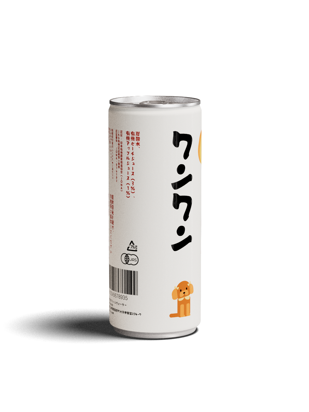
Minimalist beverage packaging design featuring Japanese sparkling water can with strategic bilingual typography layout and organic certification marks. Professional design studio execution showcasing contemporary Japanese packaging aesthetics through clean white aluminum can with vibrant green text hierarchy. Creative branding agency work demonstrating expertise in Asian beverage market positioning with subtle yellow accent elements and precise typographic grid system for premium carbonated water product differentiation.Dynamic packaging design studio creation for Japanese organic beverage featuring bold green typography on pristine white aluminum can format. Professional design agency portfolio showcasing innovative bilingual branding through striking kanji characters and strategic visual hierarchy. Contemporary packaging design demonstrating expertise in Japanese beverage market with organic certification integration and minimalist design principles for health-conscious consumer positioning.Playful packaging design for Japanese apple juice featuring minimalist fruit illustration paired with bold typographic treatment on white aluminum can. Design studio portfolio piece demonstrating creative branding through strategic use of green accent colors and bilingual text integration. Professional packaging design agency work balancing whimsical apple graphic with sophisticated Japanese typography for premium juice brand positioning in competitive beverage market.Innovative packaging design featuring Japanese beverage can with charming dog character illustration and playful typographic hierarchy. Creative design studio execution combining kawaii-style animal mascot with bold Japanese lettering on clean white aluminum format. Professional branding agency portfolio demonstrating expertise in character-driven packaging design with strategic use of orange accent colors and bilingual messaging for memorable brand storytelling in Asian beverage market.

Carbonated Water
packaging design, identity
Japan, 2025
Elegant
obsession.

Playing
with food.

High-speed
finish.

Tactile
& fizzzy.

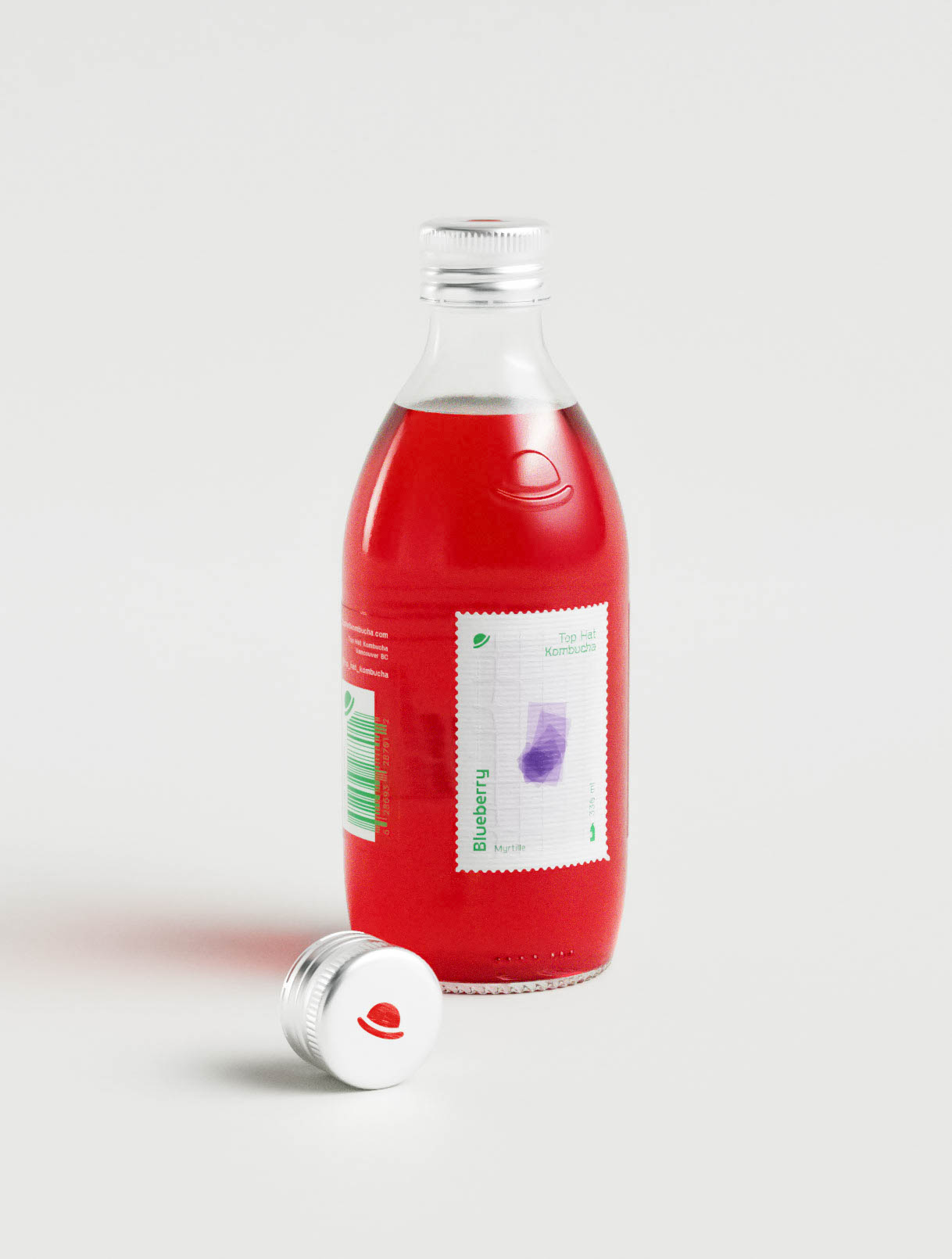
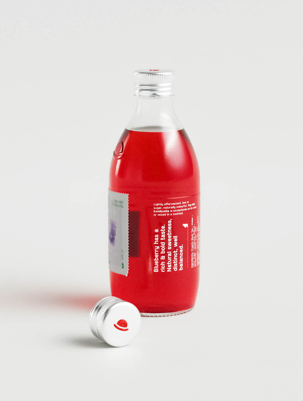
Strategic packaging design for blueberry kombucha utilizing postage stamp visual language to communicate premium artisanal positioning and ingredient authenticity. Creative design studio portfolio showcasing innovative label architecture with stamp element as hero graphic creating instant shelf recognition. Professional branding agency work demonstrating expertise in fermented beverage packaging through unique visual metaphor combining nostalgia with contemporary health food aesthetics for memorable consumer engagement.Innovative kombucha packaging design featuring unique postage stamp-style blueberry illustration creating memorable brand differentiation in competitive beverage market. Design studio portfolio piece demonstrating creative use of stamp motif as design element with perforated edges and botanical imagery. Professional packaging design agency execution balancing whimsical visual storytelling with sophisticated typography for artisanal fermented beverage branding.
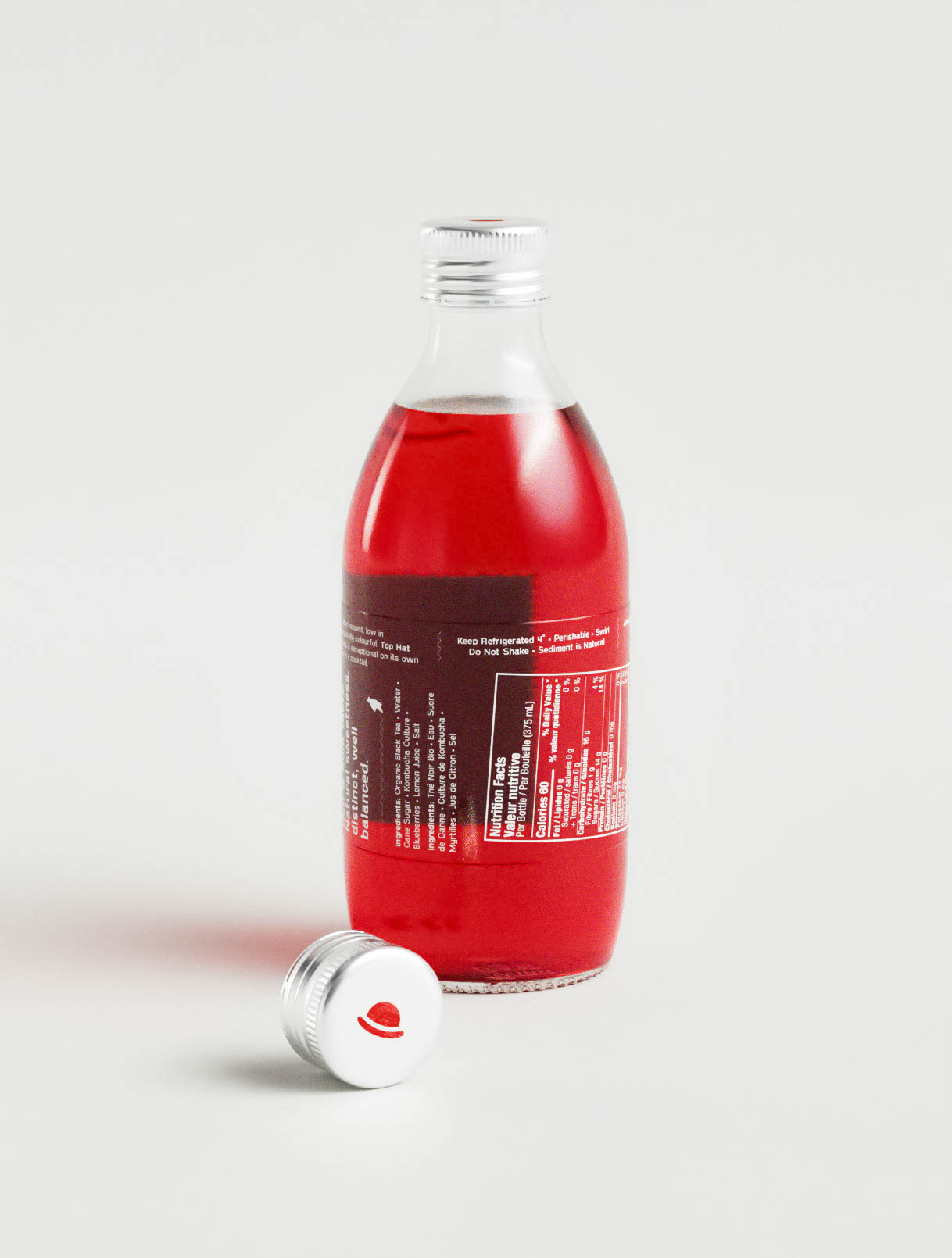
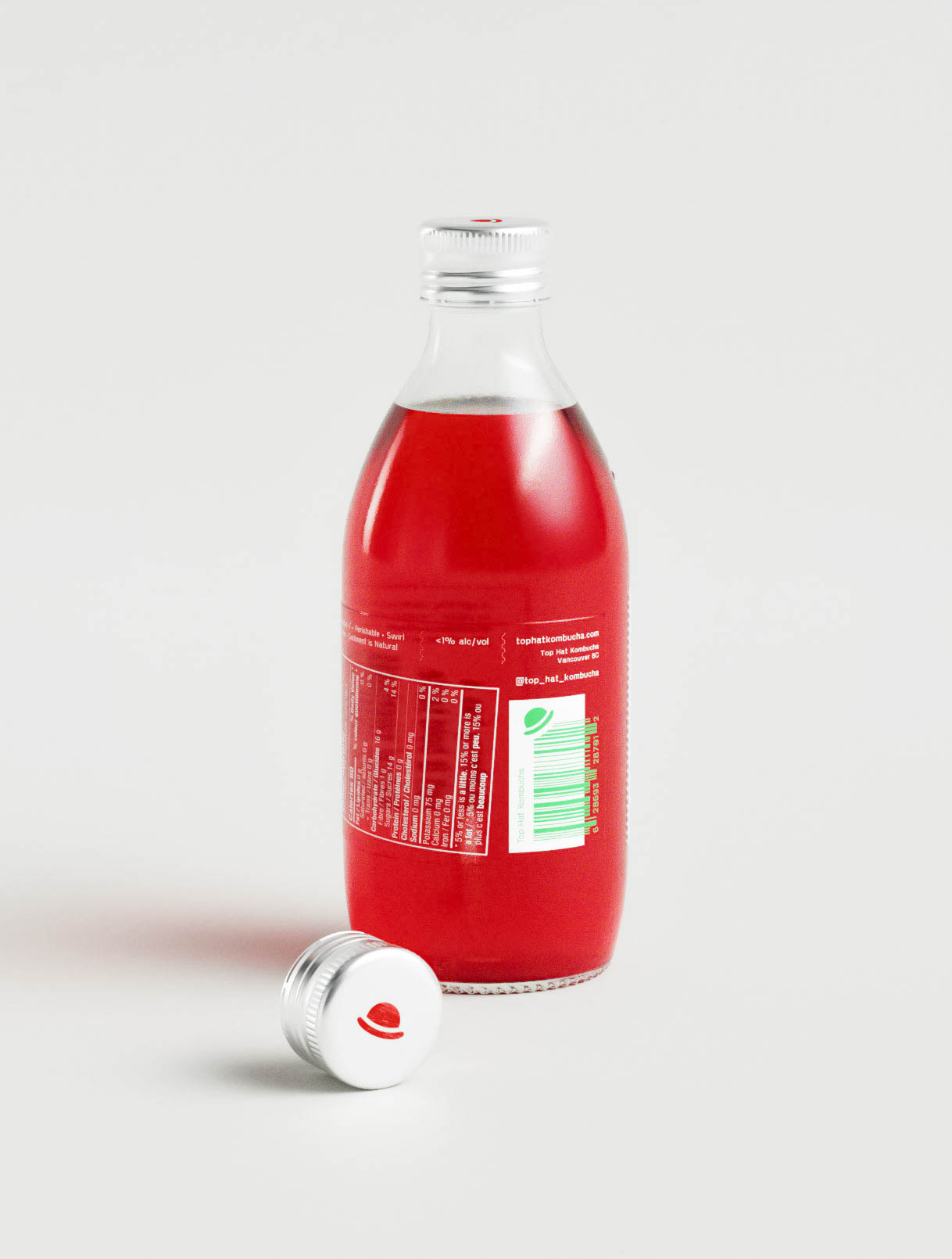
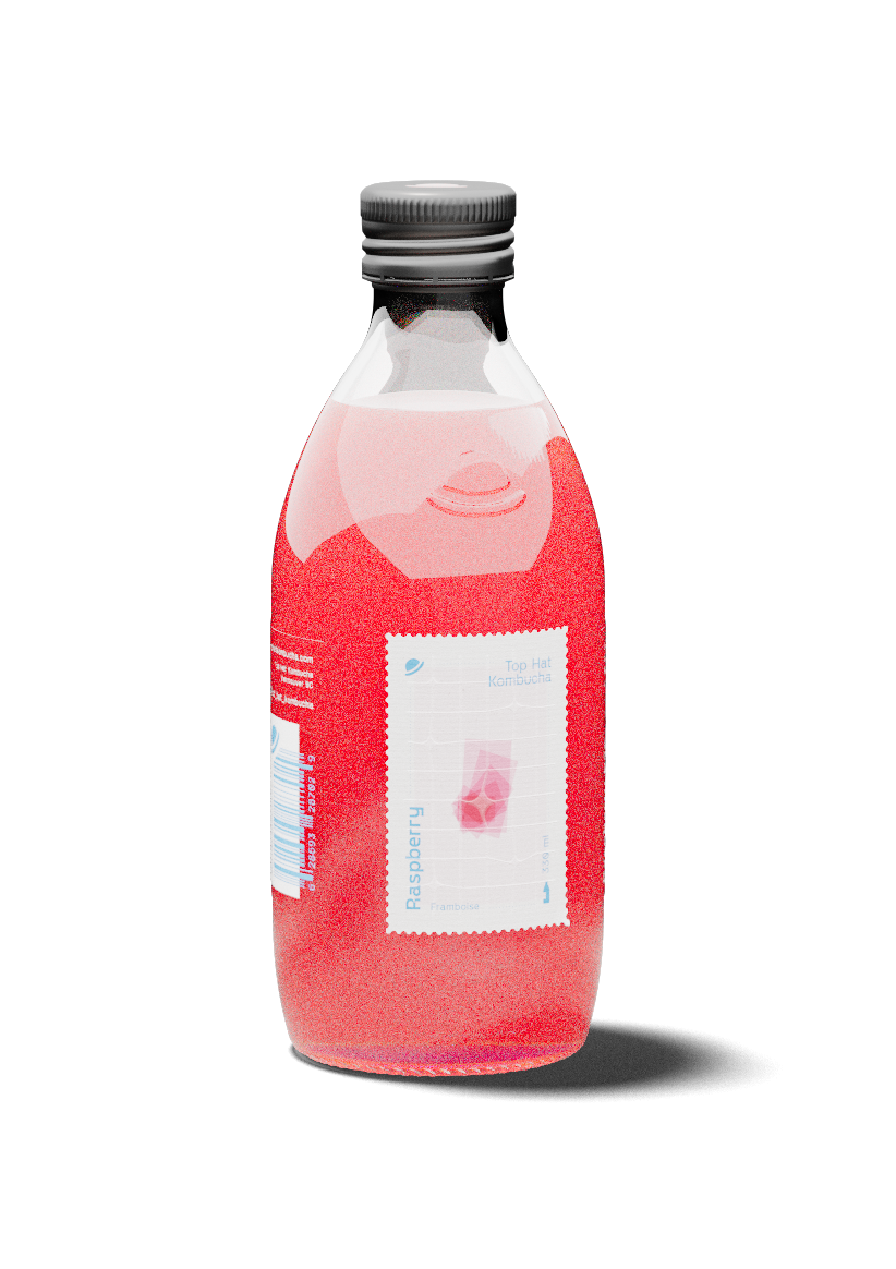
Contemporary packaging design studio work for red kombucha featuring dual-panel label system with comprehensive nutrition facts and ingredient transparency. Professional design agency portfolio showcasing strategic information architecture balancing regulatory compliance with brand messaging. Creative beverage packaging design demonstrating expertise in health food sector with bilingual typography treatment and sustainable glass bottle format for premium probiotic drink positioning.Minimalist kombucha packaging design featuring vibrant red fermented beverage in classic glass bottle with strategic label placement and nutrition panel integration. Professional design studio execution showcasing clean typography hierarchy with barcode placement and social media handle incorporation. Creative branding agency portfolio demonstrating expertise in probiotic beverage packaging with aluminum screw cap detail and transparent product visibility for health-conscious market positioning.

Kombucha
packaging design, identity
Canada, 2024

Pocket
candy.

Condensed Milk
packaging design
Ukraine, 2024

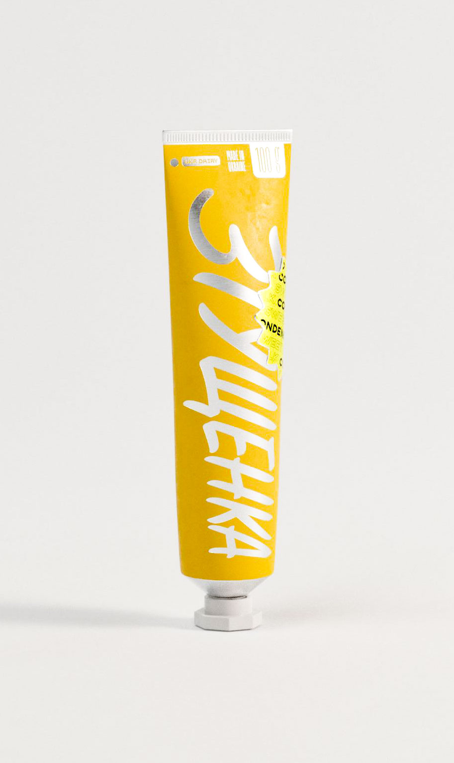
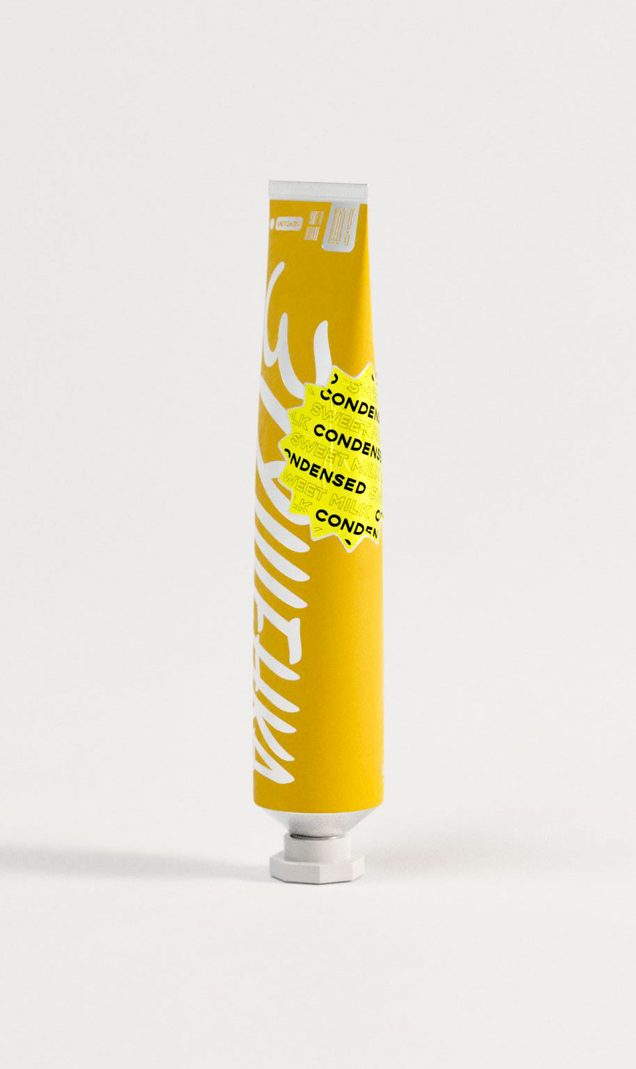
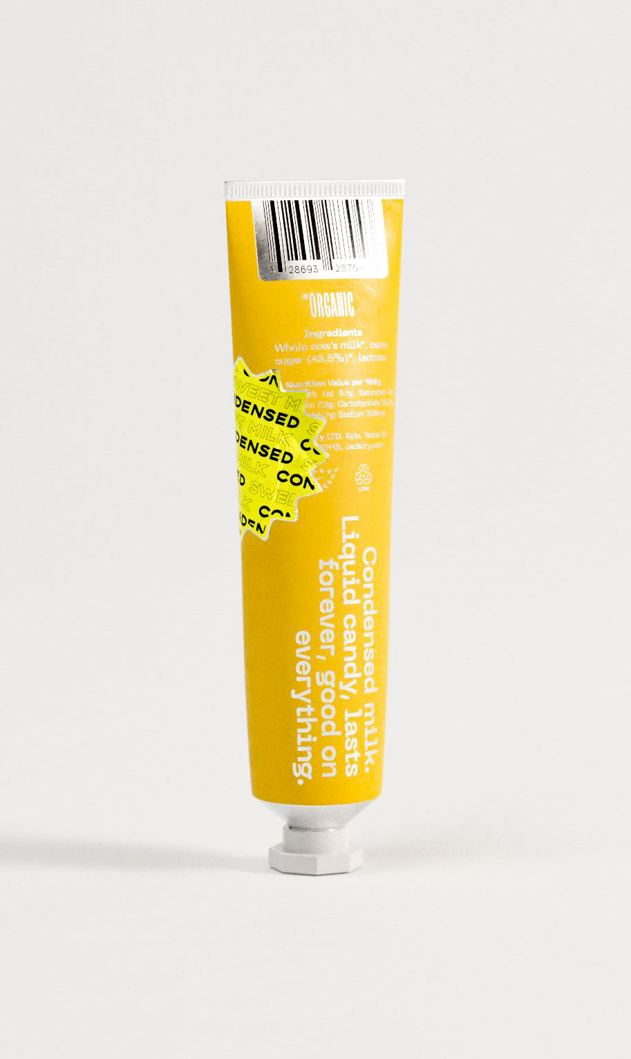
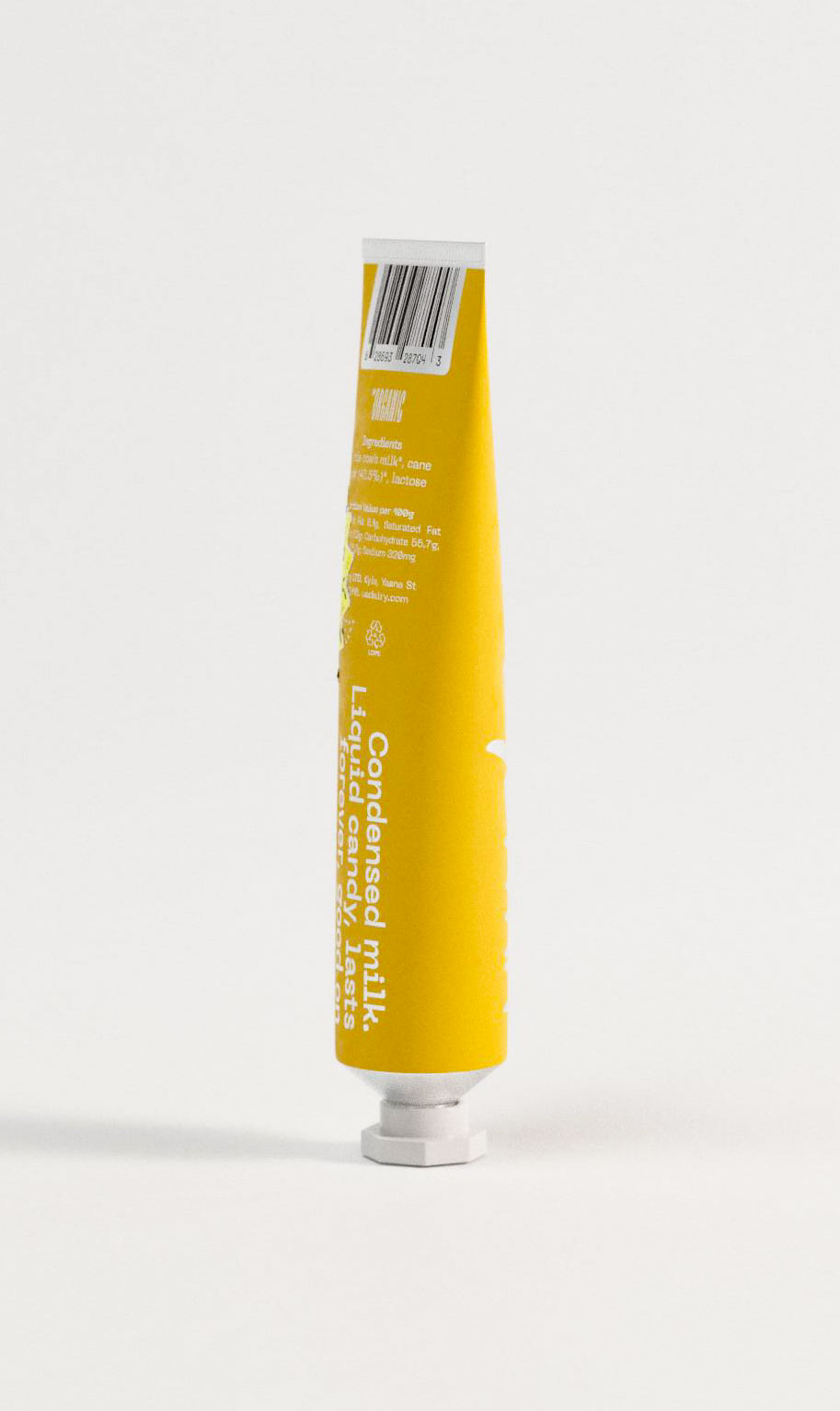
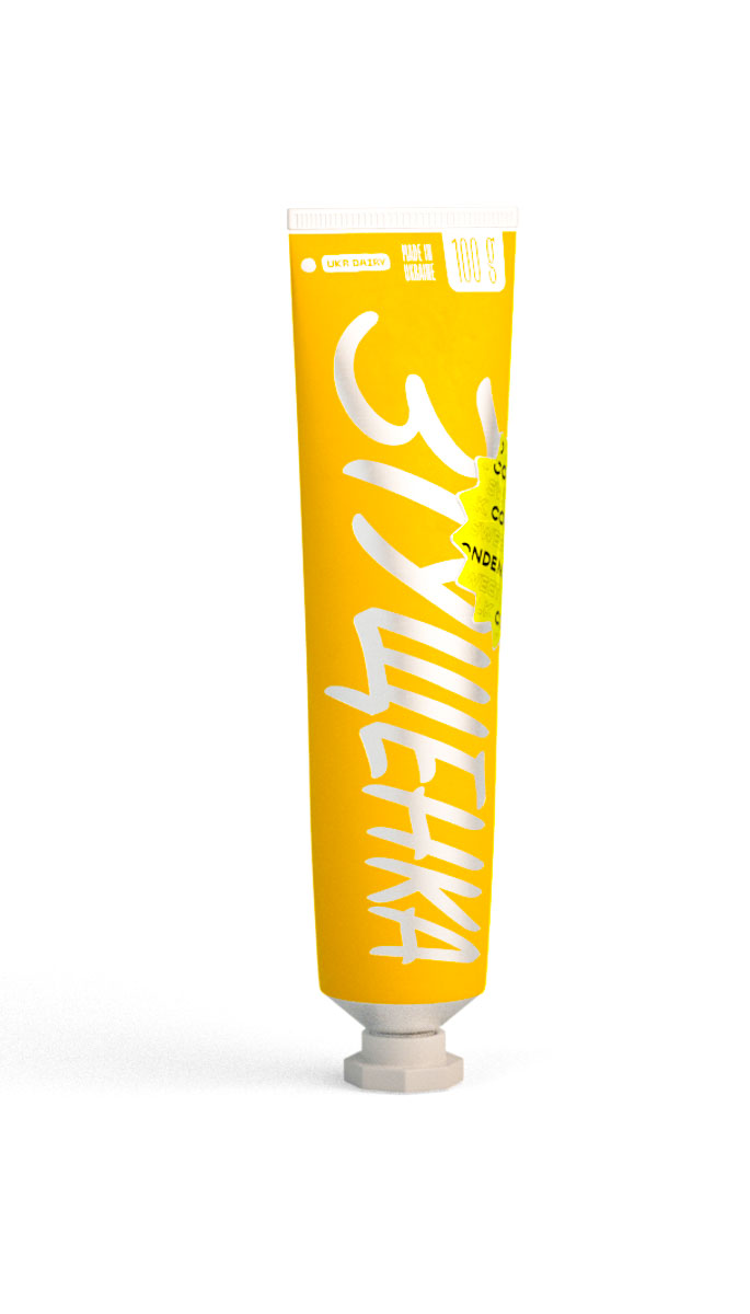
Complete brand narrative unfolds across this tubular packaging design, where script typography dances with geographic authenticity markers reading "MADE IN UKRAINE" and "100g" specifications. Design studio brilliance lies in orchestrating multiple typographic voices—from expressive brush lettering to utilitarian product details—into harmonious composition. Golden colorway suggests richness while maintaining approachability, exemplifying how packaging design transcends mere containment to become brand storytelling vehicle in competitive dairy marketplace.Packaging design that marries contemporary tube format with nostalgic script elements, demonstrating a design studio's range in typographic expression. The interplay between handwritten "SWEET" messaging and industrial aluminum substrate creates compelling tension. This branding exercise shows how design agencies can reinvent heritage dairy categories through unexpected packaging architectures, transforming mundane condensed milk into covetable pantry essential through strategic visual communication.Bold vertical letterforms command attention in this packaging design studio creation for organic condensed milk. The design leverages playful sticker-style accents scattered across the golden canvas, creating visual rhythm that speaks to artisanal authenticity. Typography becomes the hero element here—"CONDENSED MILK" reads as both product descriptor and brand manifesto. Design agency expertise evident in balancing whimsical elements with sophisticated structural packaging for shelf differentiation.Innovative squeeze tube packaging design showcasing meticulous nutritional typography and information hierarchy. This design agency project demonstrates mastery of regulatory compliance merged with aesthetic appeal, featuring organic certification prominently displayed against warm golden substrate. The aluminum tube format challenges traditional dairy packaging conventions, with strategic use of negative space allowing critical product information to breathe while maintaining visual cohesion essential for premium positioning.

Tastes better
cubed.

Ice Cream
packaging design, identity.
Canada, 2024

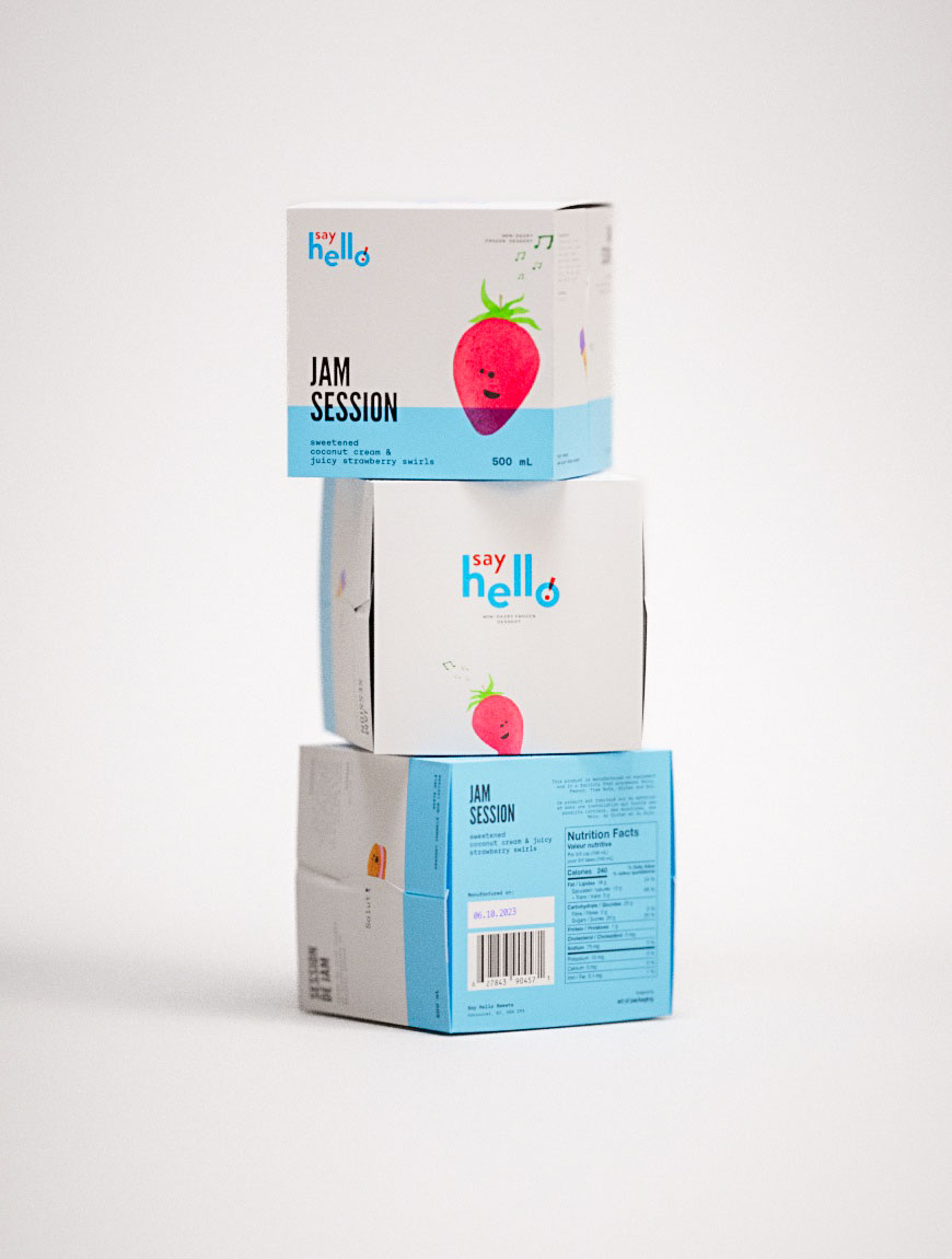
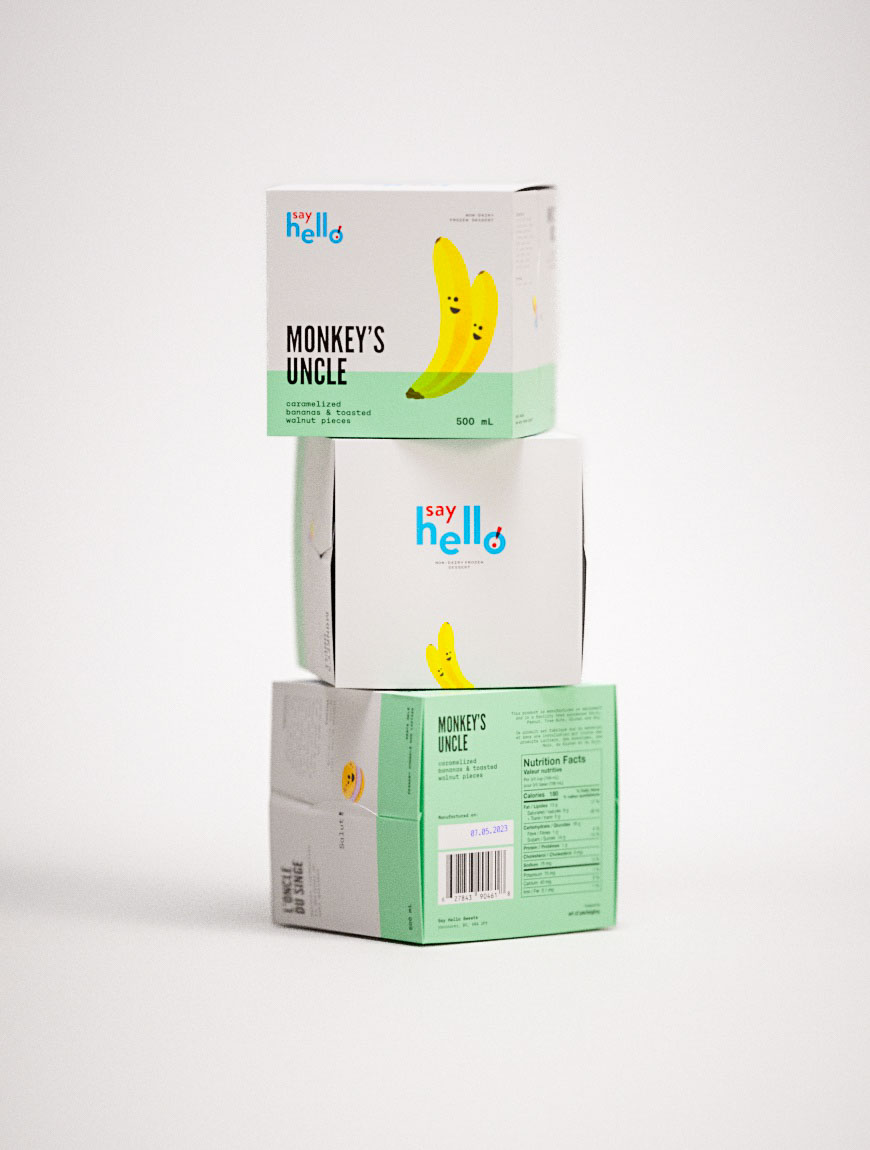
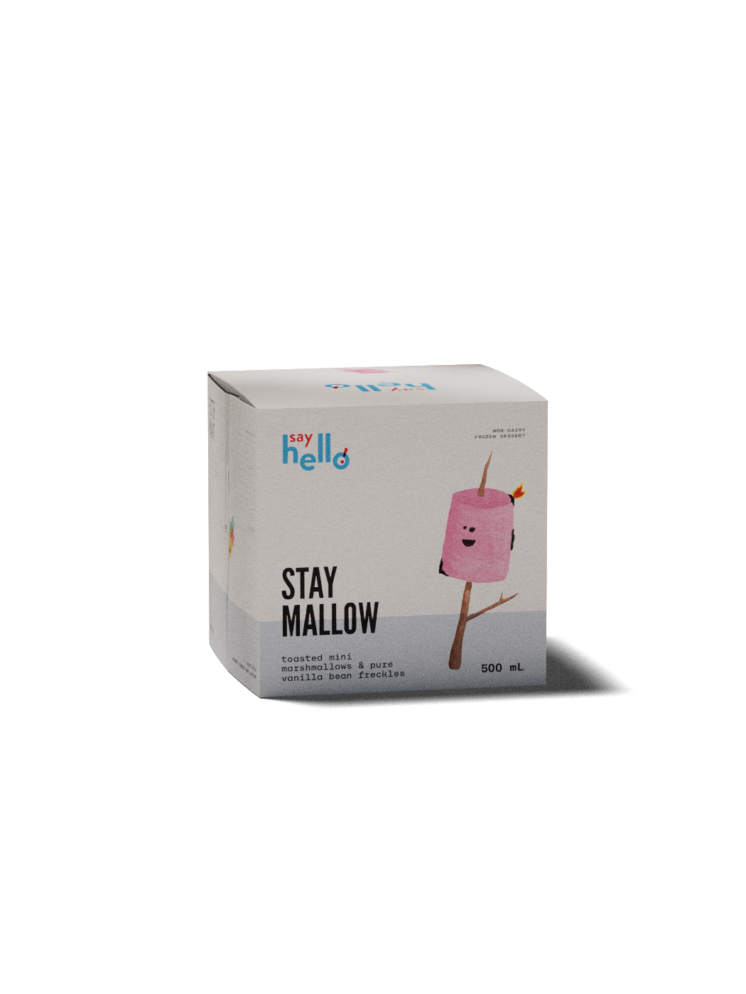
Contemporary packaging design showcasing Say Hello's Jam Session beverage cartons with whimsical strawberry character illustration. Three-tier product display features bold typographic treatment, minimalist design aesthetic, and strategic color blocking in cyan and coral. Professional studio photography highlights innovative structural packaging design for 500ml containers, demonstrating creative branding agency expertise in consumer packaged goods. Clean white backdrop emphasizes the design studio's attention to visual hierarchy and modern packaging solutions.Charming packaging design solution featuring Say Hello's Meet Your Matcha beverage with anthropomorphic tea leaf and companion characters. Design agency's creative direction merges soft pink backgrounds with vibrant green accents, showcasing expertise in emotional branding through illustration. Multi-panel carton design exemplifies modern typography principles and playful visual communication strategies. Studio photography emphasizes dimensional packaging structure and cohesive brand system development across 500ml formatInventive packaging design for Say Hello's Monkey's Uncle beverage featuring expressive banana character illustrations on mint green substrate. Typography-forward design approach demonstrates branding agency capabilities in creating memorable shelf presence through bold headline treatment. Creative studio work showcases strategic color theory application and characterful visual narrative across stackable carton system. Professional packaging design integrates playful brand personality with functional nutrition labeling and sustainable packaging architecture.

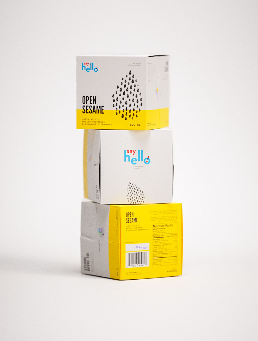
Striking beverage packaging design for Say Hello's Open Sesame line featuring abstract seed pattern graphics. Design studio execution balances playful yellow colorways with sophisticated typographic elements across stacked carton architecture. Premium packaging design demonstrates creative agency mastery of visual storytelling through minimalist illustration and strategic brand positioning. Professional product photography captures innovative structural design details and nutrition panel integration for contemporary beverage branding.

Simplicity
and rhythm.

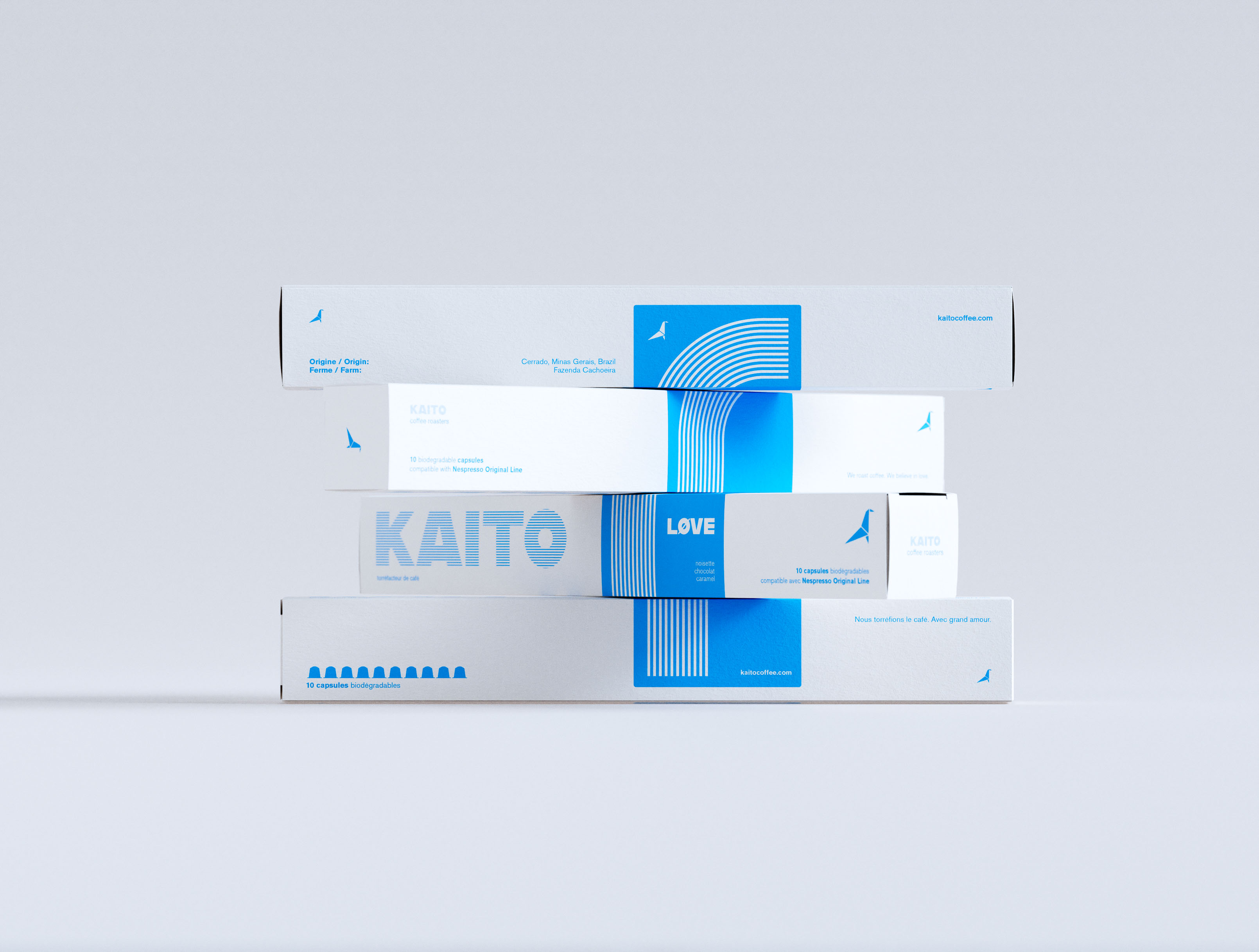
A visually engaging stack of four KAITO coffee capsule boxes arranged in an offset composition, emphasizing the modular and graphic nature of the packaging system. Each box features crisp white surfaces with a consistent electric blue accent, incorporating geometric shapes, linear patterns, and structured typography. The bold typographic logo contrasts with fine-line illustrative elements, suggesting a refined balance between graphic design clarity and expressive branding. Ideal lighting and a soft backdrop highlight the thoughtful art direction and brand identity created by a packaging design studio specializing in sustainable coffee products.A neat vertical stack of four coffee capsule boxes, designed in a minimalist cream-white and cobalt blue palette, set against a neutral grey background. The packaging design features bold sans-serif typography, a stylized linear arch motif, and clean typographic hierarchy. The brand name "KAITO" is prominently displayed using striped lettering, while the word "LOVE" appears in contrasting bold white on a blue field. The layout integrates bilingual text and includes capsule compatibility information in small print. This image exemplifies considered packaging design, modern branding, and structured graphic design work from a packaging design agency.

Coffee Pods
packaging design
Canada, 2023