All Tinned In

Shiny tins, striking colors, illustrations, delicious coffee. Showcase piece in your kitchen.

Packaging

Identity

Materials

Branding

Strategy

+
Project Info
+
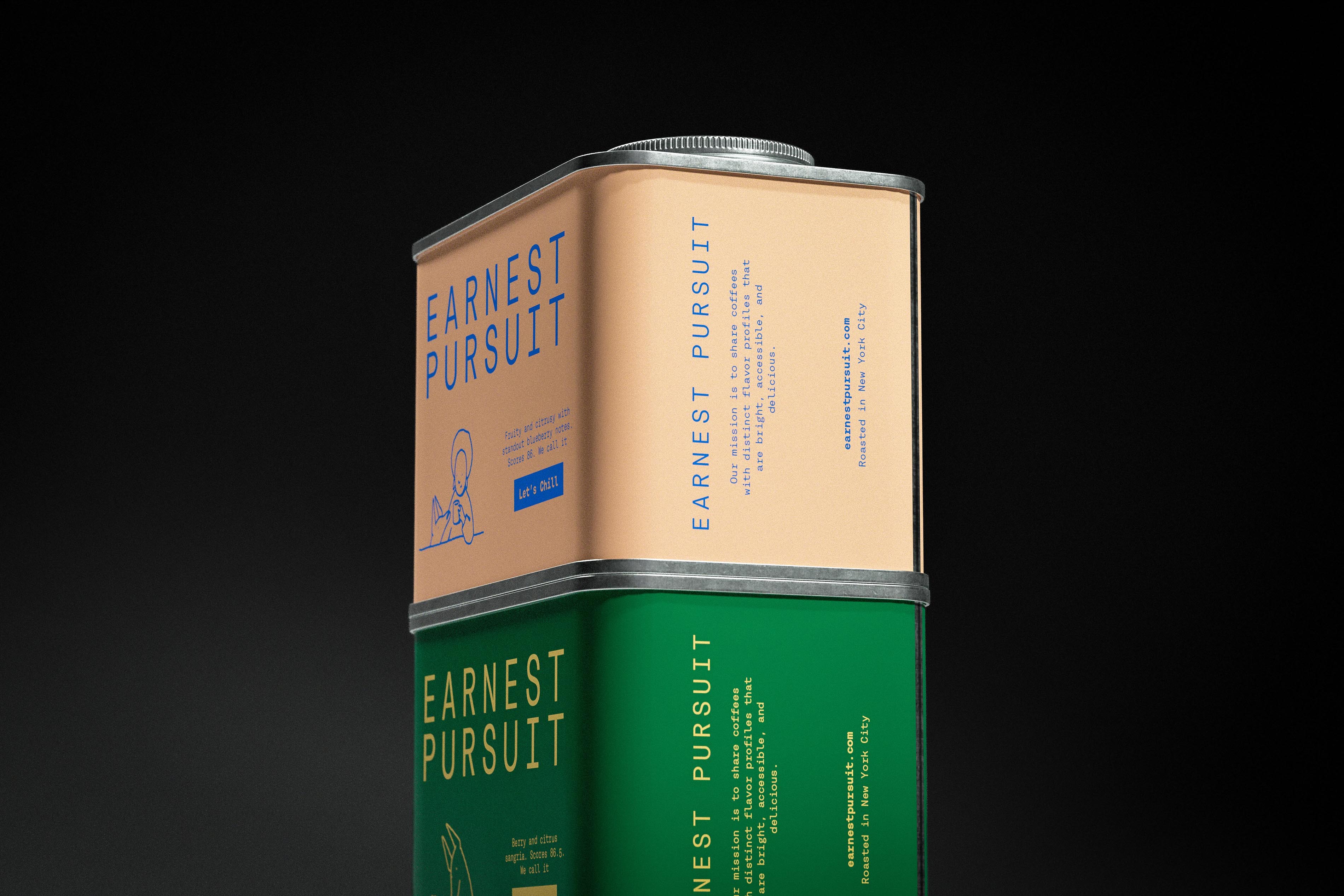
Shot low against a black void, the peach Earnest Pursuit tin sits on a green one like a two-storey building with good manners, its knurled cap and rolled seams catching the only light in the room. The stacked monospaced wordmark faces front, while the narrow side runs the name vertically beside the mission statement and "Roasted in New York City". On the front, a line drawing and the copy "Scores 86. We call it" lead to a blue "Let's Chill" label, so the coffee's name lands as a payoff rather than a headline. The tin and the photograph are both Art of Packaging's work.
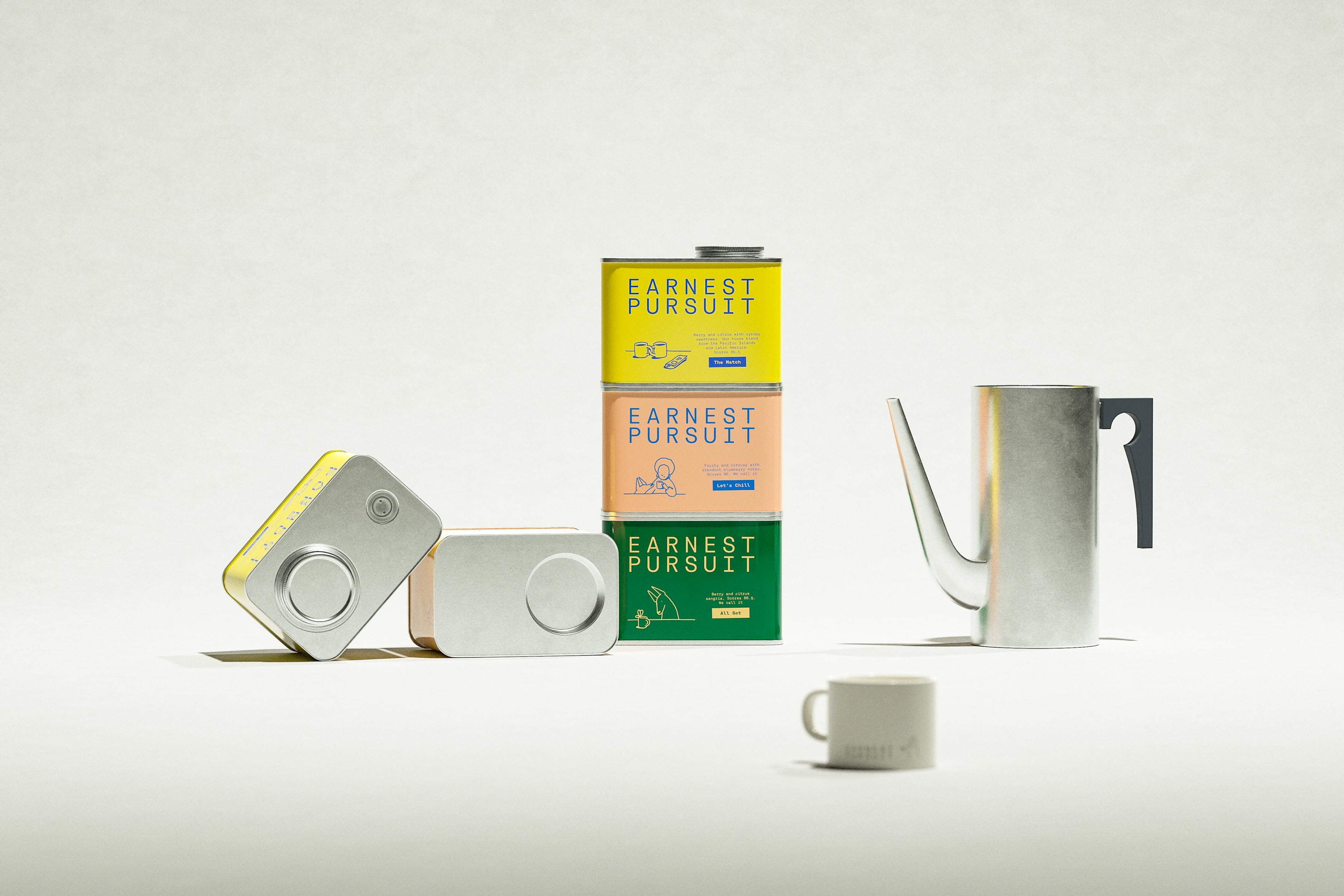
A yellow, peach and green stack stands in the middle of a pale set, flanked by two tins lying on their sides to show bare metal ends, a brushed-silver pitcher with a charcoal handle on the right and a small cream mug in the foreground. The stack is where the color lives; everything else is metal, ceramic and calm. Art direction that lets the tins be the only things with a personality, and not a single coffee bean in sight. Branding and packaging design by Art of Packaging, which can style a coffee scene without any coffee.
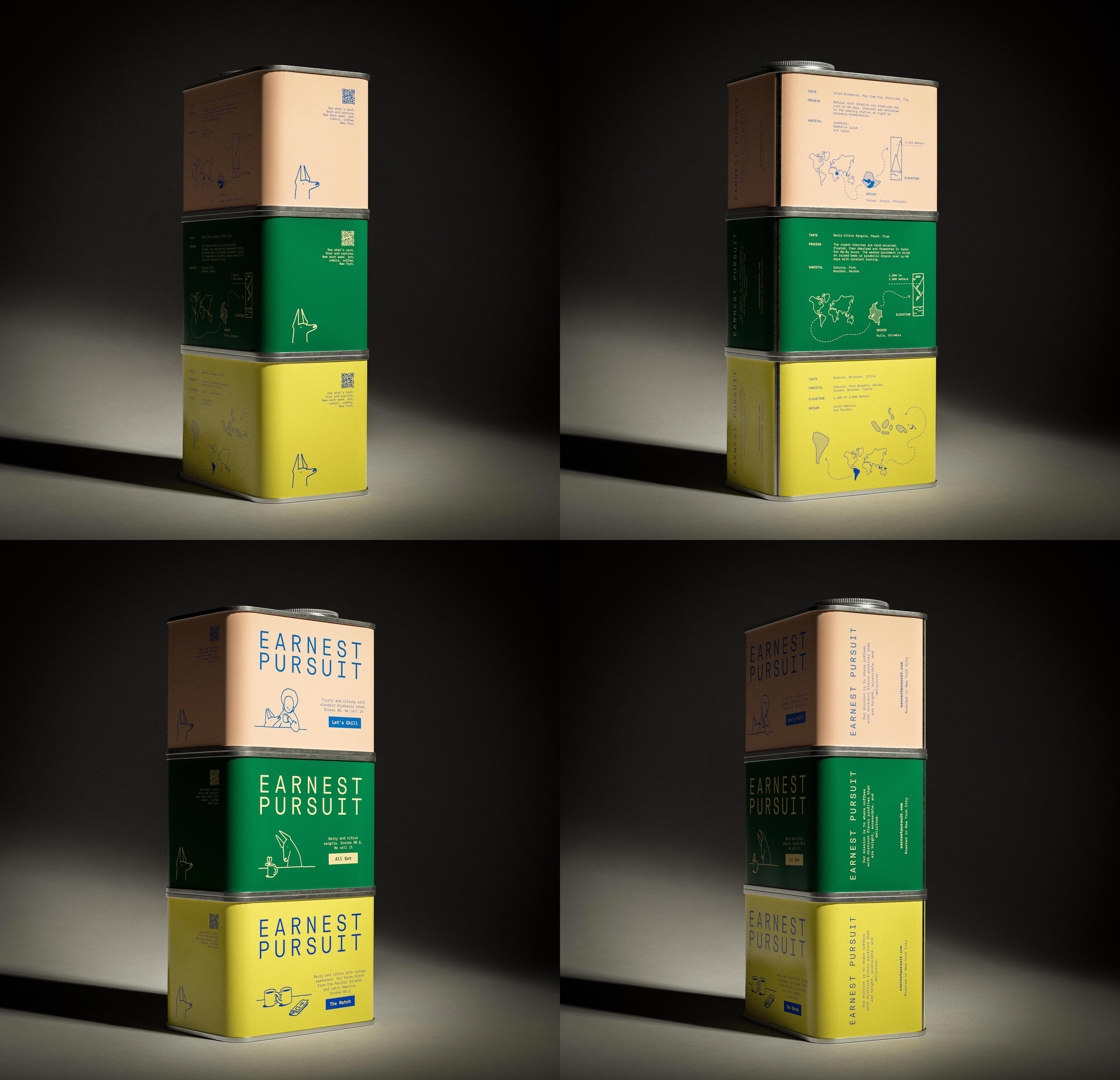
A four-panel study of one three-tin stack, peach, green and yellow, lit by a single hard spot from the side so each frame falls away into near-black. Turning the stack a quarter per frame walks around the whole label: the QR back with "See what's next. Scan and explore.", the data panel with maps and altitude graphics, the front with the stacked wordmark and character drawings, and the narrow spine set vertically. Holding identical light across four exposures is the real discipline here, the kind nobody notices until it goes missing. AOFP Studio photographed the set and designed the packaging for Earnest Pursuit.
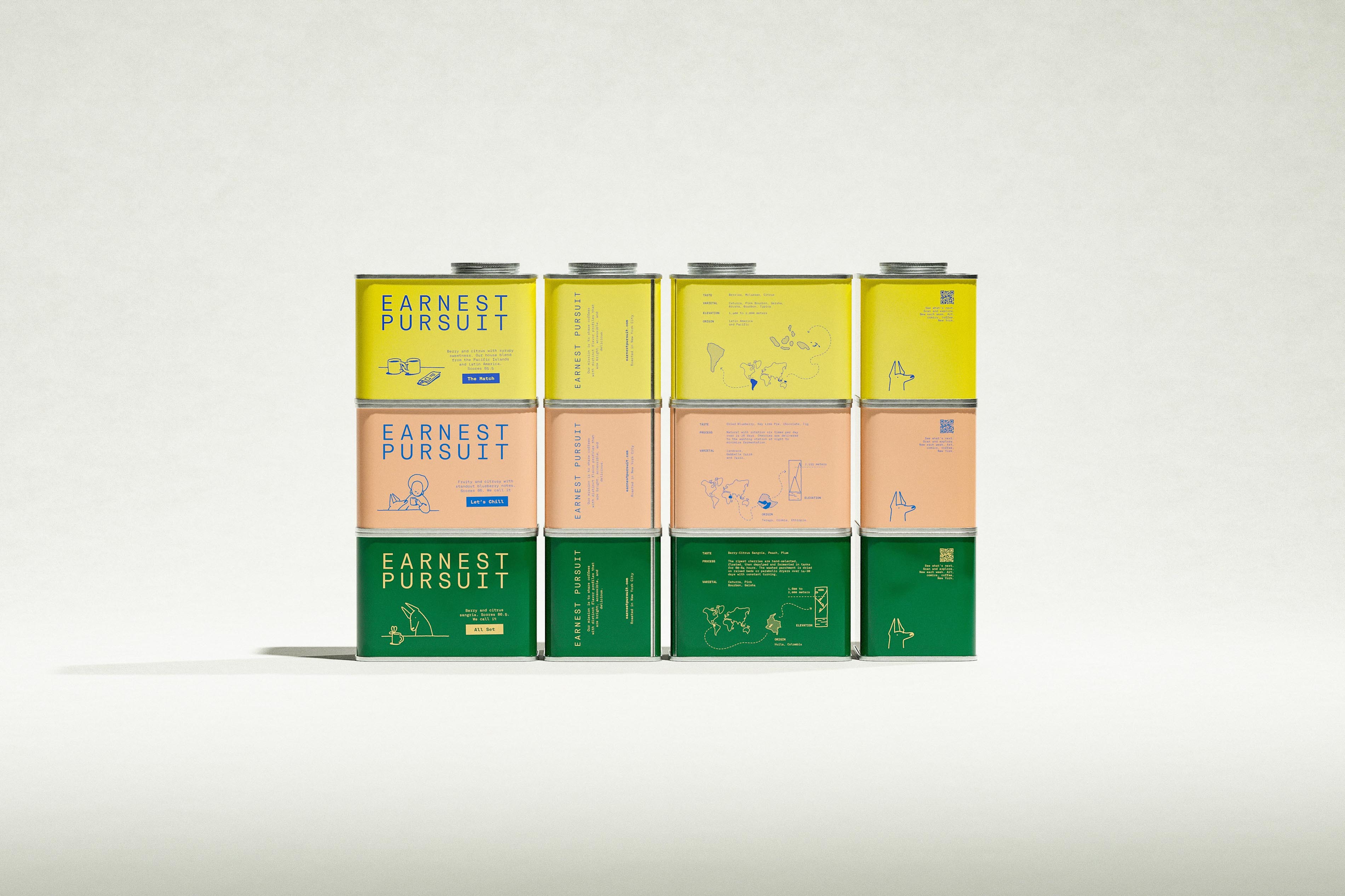
Twelve Earnest Pursuit tins in a four-by-three block on a pale backdrop read like a flat label unrolled and lined up for inspection: each column shows one face, front, spine, origin panel or QR back, and each row is one coffee in yellow, peach or green. Blue ink sits on the two lighter grounds and cream on the green, a two-color rule every tin in the frame obeys. The graphic design and CPG packaging come from Art of Packaging, organized with the patience of a librarian.
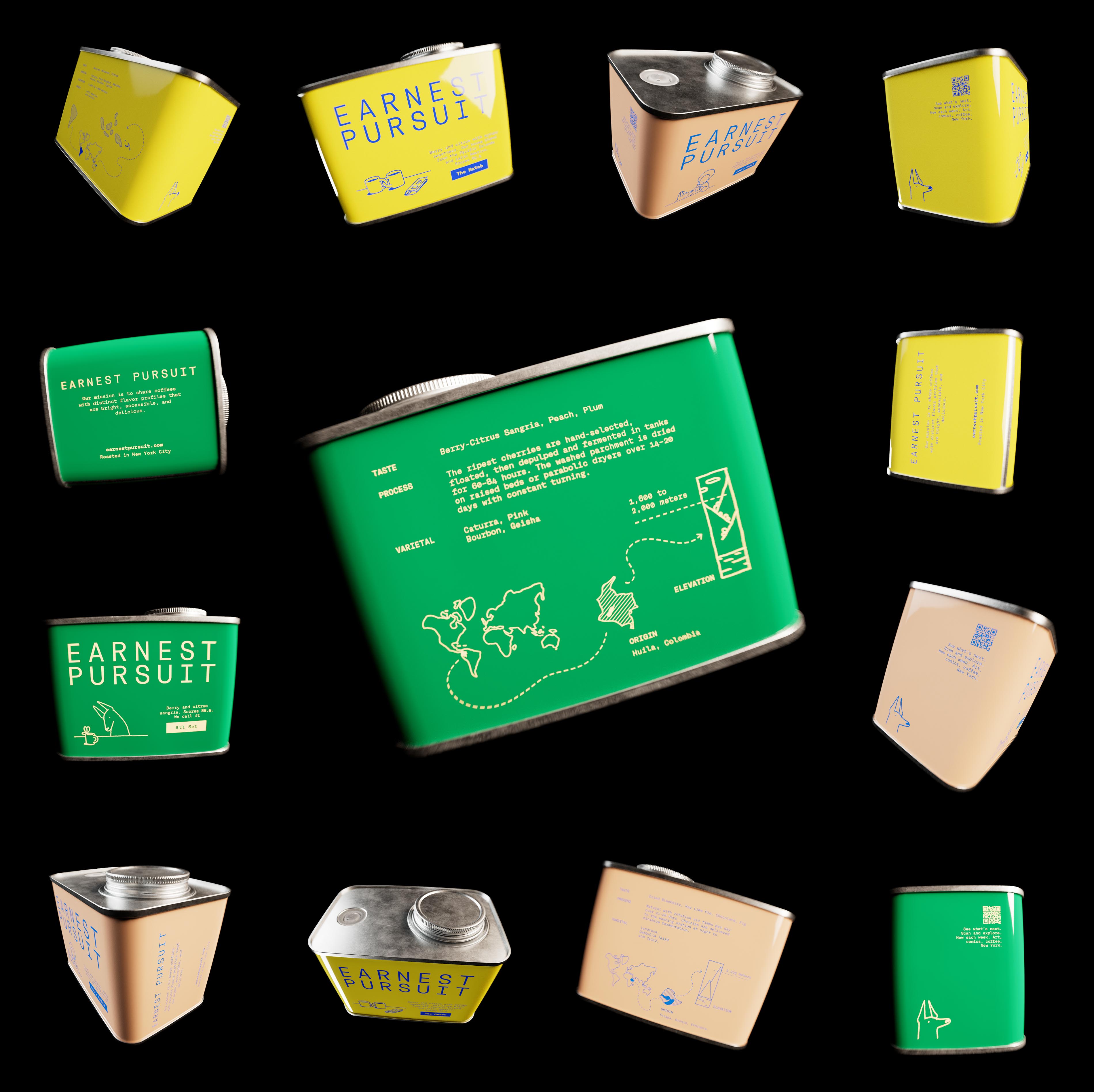
On black, a ring of Earnest Pursuit tins tumbles around one green tin turned to its back panel, where TASTE reads "Berry-Citrus Sangria, Peach, Plum", the process note describes cherries "hand-selected, floated, then depulped and fermented in tanks for 60-84 hours", and a dashed route crosses a world map to Colombia before climbing to "1,600 to 2,000 meters" beside "Huila, Colombia". The orbiting tins show fronts, spines, QR panels and bare lids, a product range arranged like a small solar system with better typography. Creative direction and specialty coffee packaging by AOFP Studio.
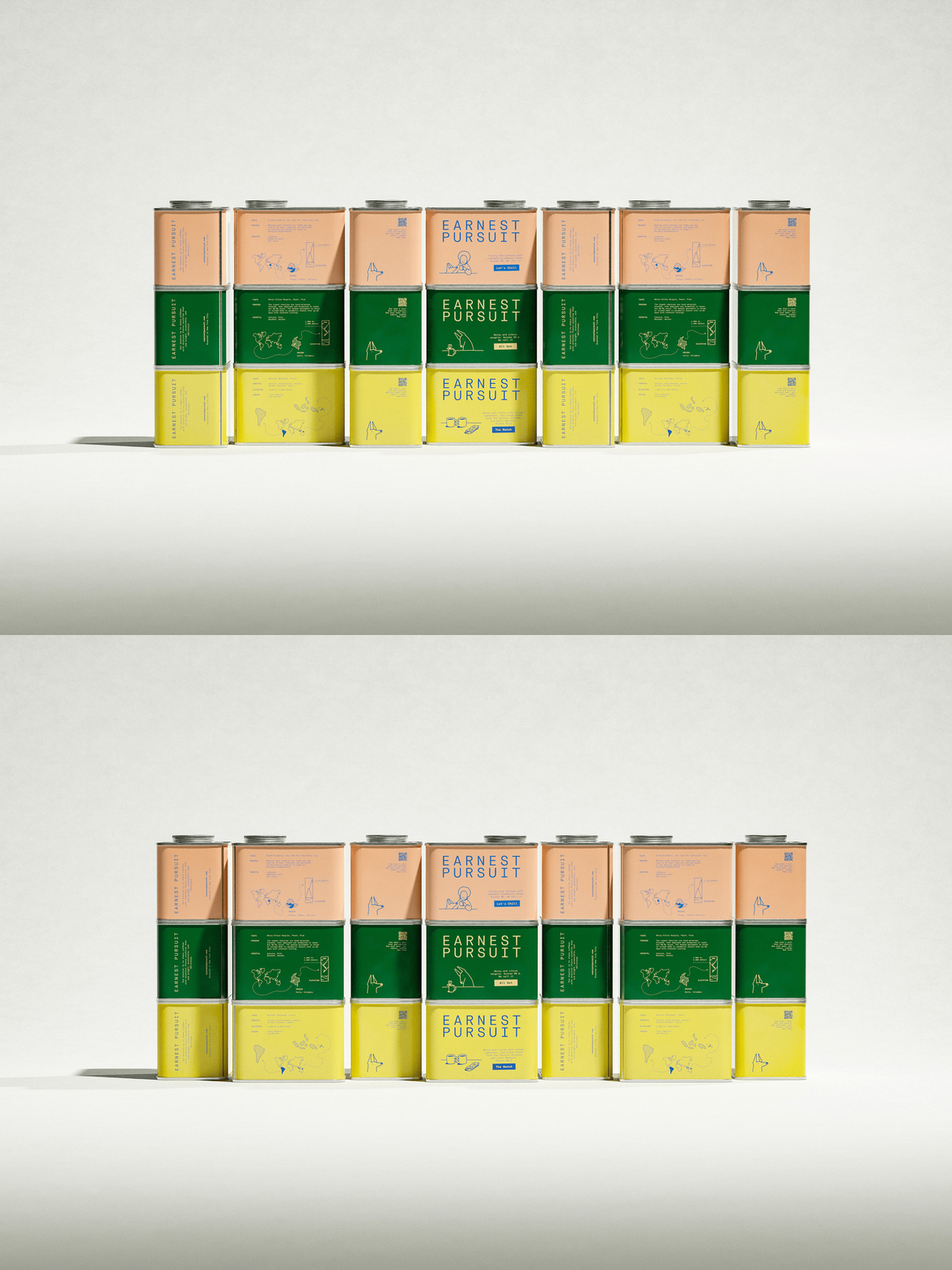
Two frames loop a wall of twenty-one Earnest Pursuit tins, seven columns by three rows of peach, green and yellow, with the central column facing forward to show the stacked wordmark and the others turned to spines, origin panels and QR backs. Between frames the tins pivot slightly, so highlights slide and shadows lengthen while the grid stays put, the minimum movement that still qualifies as animation. One label layout serves every coffee with only the ground color and ink swapped, which is how this packaging and branding studio scales a CPG range without redrawing it.
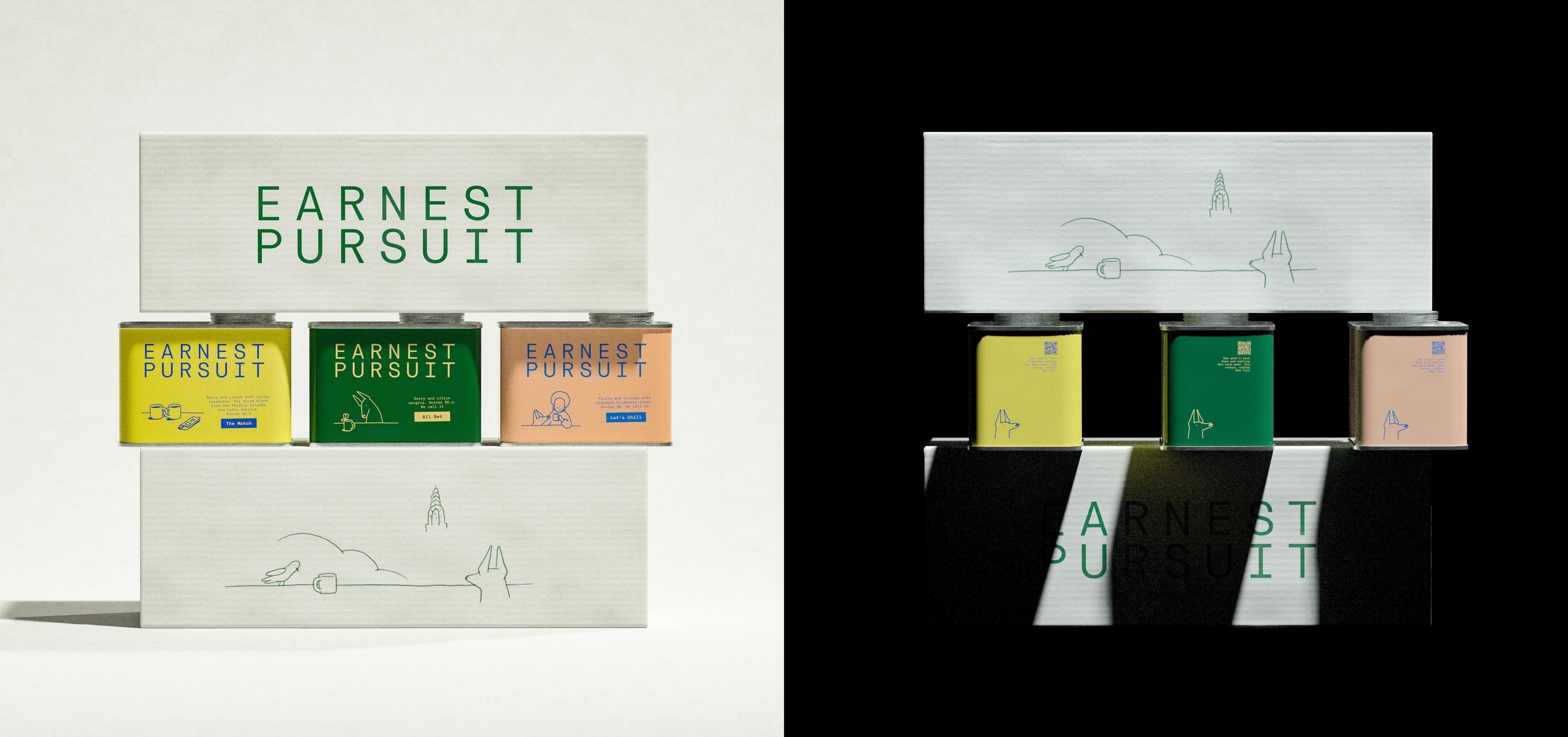
Two views of one Earnest Pursuit shipping box sit side by side. In daylight, the white ribbed box shows the green wordmark on its upper panel and a long line drawing below, a bird, a mug, cloud tops, a stepped Art Deco tower and a dog, with yellow, green and peach tins slotted into a cutaway band between them. In the dark view the box faces the other way, the tins turn their QR backs outward, and blades of shadow slice the lower wordmark into something close to a ransom note. The box structure and both photographs are AOFP Studio's work.
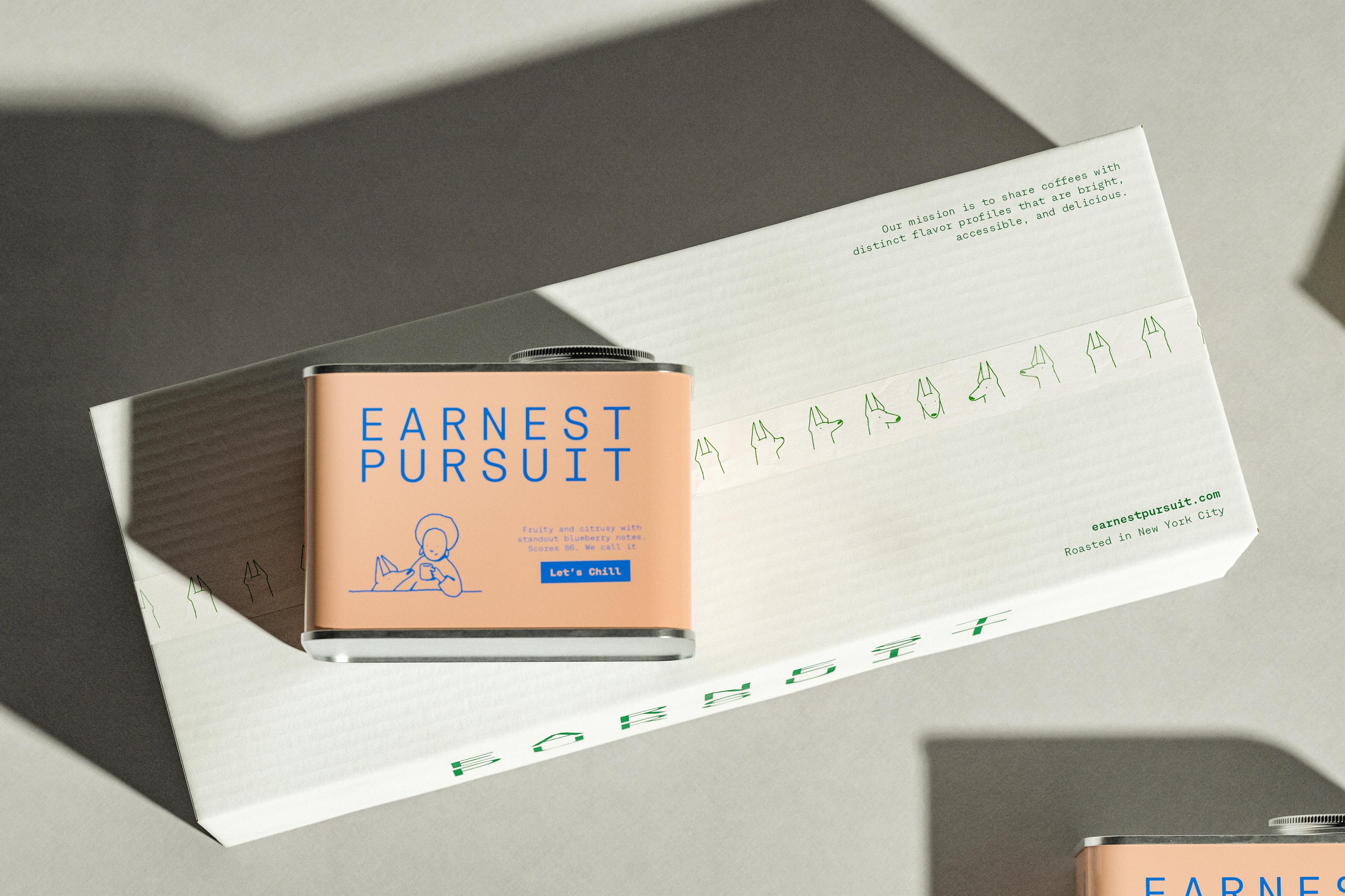
Hard sun from above throws long grey shadows across a white corrugated Earnest Pursuit shipping box, its seam taped with a band of green dog heads drawn in single strokes and turned every which way. A peach tin rests on top, and the box carries "Our mission is to share coffees with distinct flavor profiles that are bright, accessible, and delicious." along with "earnestpursuit.com" and "Roasted in New York City", while the wordmark runs off its lower edge. The branding studio pushed the identity all the way down to the tape, a level of commitment most brands reserve for the logo.
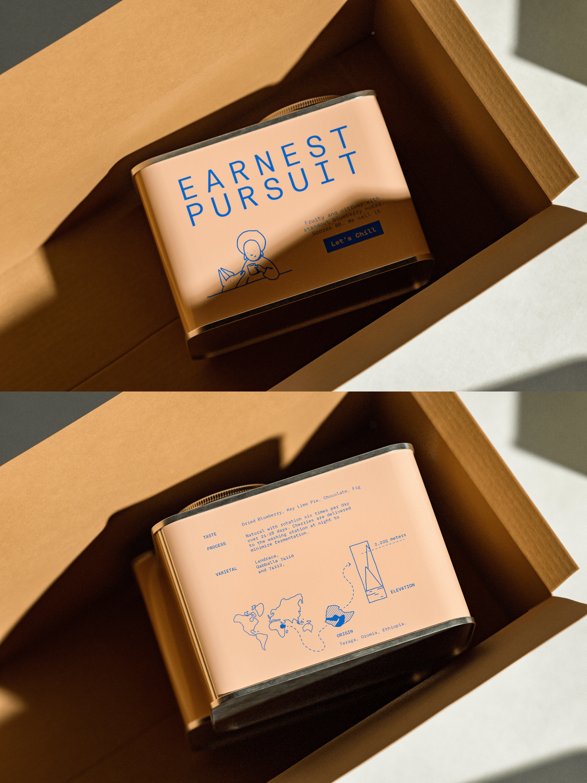
A two-frame loop flips a peach Earnest Pursuit tin inside an open kraft box. First the front: the blue wordmark, a line drawing of a woman holding a mug beside her dog, and the "Let's Chill" tag. Then the back: "Dried Blueberry, Key Lime Pie, Chocolate, Fig", a natural process with rotation "six times per day over 21-28 days", "2,225 meters" and "Teraga, Oromia, Ethiopia." Low, warm light soaks the kraft and pushes the tin toward caramel, the packaging equivalent of golden hour, under art direction from AOFP Studio.
A spare sheet of black line drawings by illustrator Great What Art for the Earnest Pursuit labels: four tall vertical frames holding peaks, a tree on a slope and ruled water lines, a world map traced with a deliberately uneven hand, a crescent moon, a tulip in a slim vase and a small sun. On the tins these icons stand in for altitude and origin, so the data never has to look like data. Set into the label system by Art of Packaging beside its monospaced type, they amount to information design disguised as doodling.
A grid of twelve small ink vignettes by Great What Art tells an Earnest Pursuit day in objects: a hand reaching for a mug, a dripper over a carafe beside a hand grinder, a magnifying glass over a cup, rows of beans, a slim tower, a tap releasing a drop of coffee, a dog leaping at something midair, a rainbow, a steaming bean, two dogs mid-daydream and a tree on a hillside above water. Each sits in generous white space, the illustration equivalent of speaking softly. The identity design studio deploys the set as spot art across the brand.
A line animation by Great What Art for Earnest Pursuit. At left, a dog with tall pointed ears hides behind an open newspaper, eyes shifting over the page, flanked by a striped traffic cone and a small mug; at right, two framed panels, a grinning man with a cup in hand and an oversized cup of coffee wearing a contented face, slide apart like doors to reveal the man and his dog standing in the gap. Motion is rationed to a glance and an opening, so the joke lands without a drumroll. The panel pair reappears on the brand's wall ad, part of the outdoor work Art of Packaging directed.
Great What Art drew eight character scenes, each balanced on one tabletop line, and they share a sheet with the stacked Earnest Pursuit wordmark in the last slot. The cast: a woman cradling a mug as a dog leans in, a donkey studying a mug with a ribbon bow, a bald man thinking with his chin in his hand, a huge grinning mug holding a small cup beside a dog, two mugs whose handles hook into an N, a butterfly drawn to a steaming cup, and two window views of a tower with a bird on the sill. Art of Packaging cast three of them as tin fronts, so each coffee meets the buyer as a character before the tasting notes do.
Great What Art draws the brand's pointy-eared dog sixteen times around the Earnest Pursuit wordmark, which runs across the center in widely tracked monospaced capitals: seven heads along the top, seven along the bottom and one at each end, turned left, right, forward and away. The arrangement turns a mascot into a repeatable border, and the dogs collectively appear to be monitoring the logo for misuse. The identity design sets drawn wobble against mechanical type, a tension the packaging studio carries onto tape and mailers.
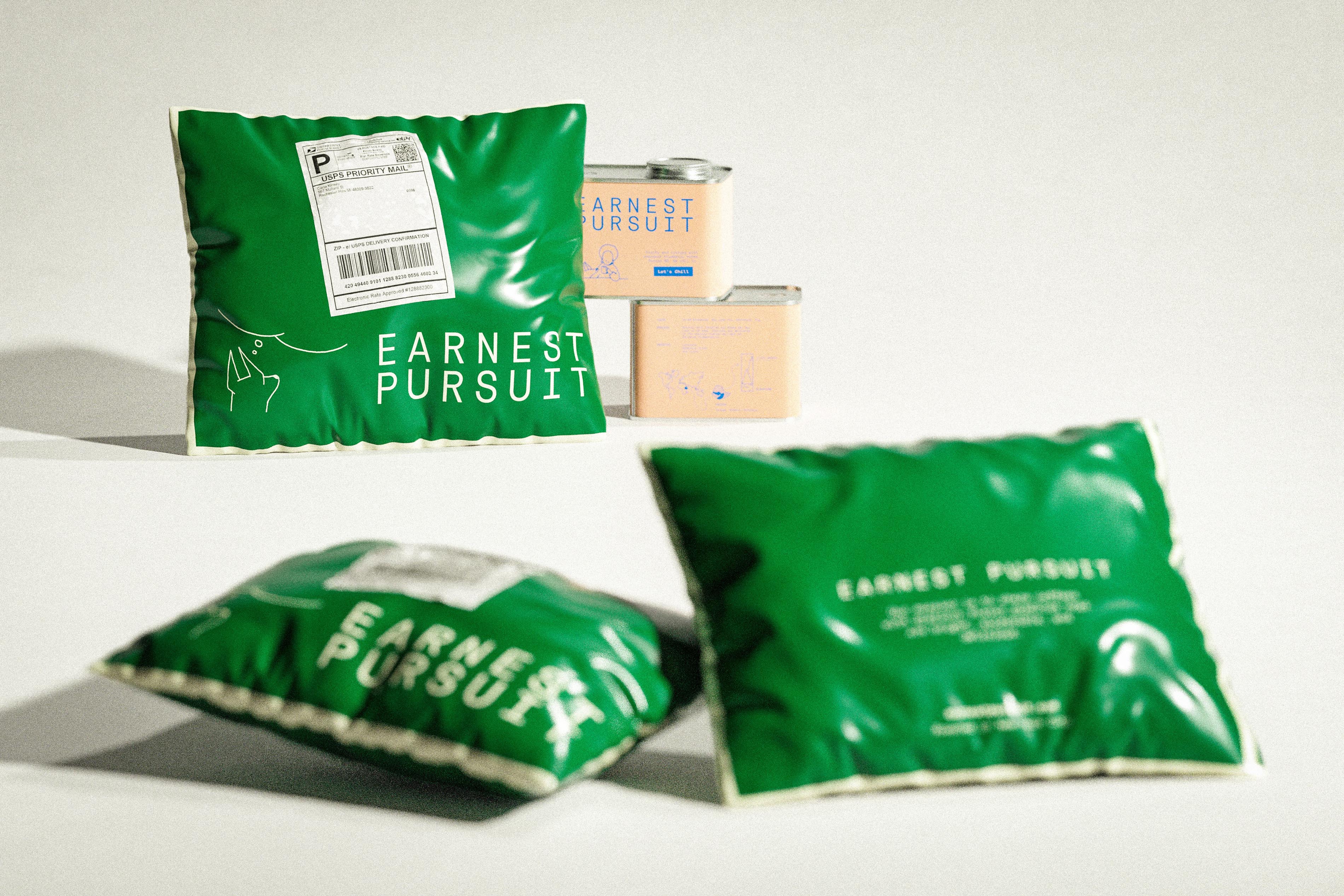
Three puffy green mailers in high-gloss film, edged with cream piping, lie in front of two stacked peach Earnest Pursuit tins on a pale set. The upright mailer wears a shipping label marked USPS Priority Mail, and beneath it the brand's dog daydreams in a white thought bubble next to the wordmark; the other two show the wordmark at scale and a small block of text. Shallow focus blurs the foreground bags and keeps the tins sharp, which inverts the usual hierarchy and somehow works. The e-commerce packaging and the photograph come from a packaging and branding studio.
Six Earnest Pursuit product cards lie flat in three front-and-back pairs, green, peach and yellow, each punched near the top, with a kettle's spout and long shadow intruding from the corner. Fronts echo the tins, wordmark plus drawing plus tasting note; backs carry the spec sheet, running from Taste and Produced by down to Our score, and close with wholesale contact details. Bold labels against regular values is the entire hierarchy, a restraint that would make a tax form jealous. Graphic design from a branding and packaging studio.
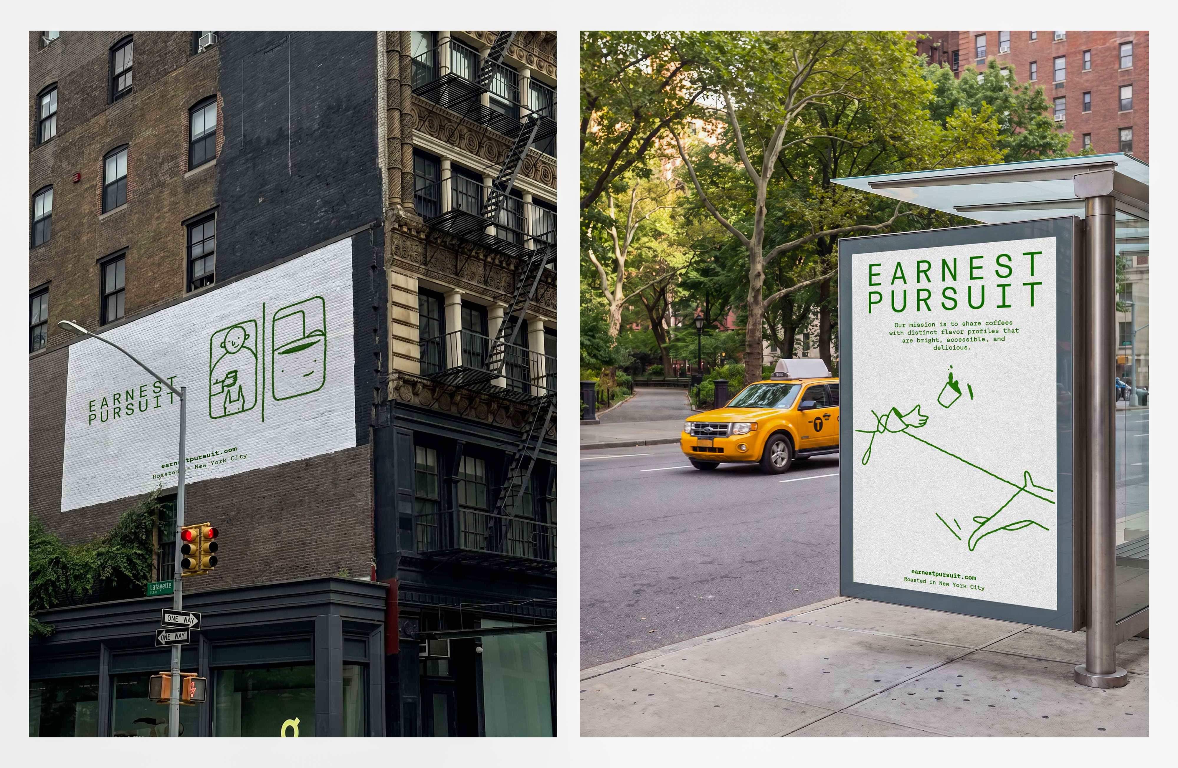
A diptych of Earnest Pursuit out-of-home pieces. Left, a white painted ad on a brick facade above a Lafayette street sign carries the wordmark, two framed panels of a smiling man with a cup and a mug with a face, and the lines "earnestpursuit.com" and "Roasted in New York City". Right, a bus-shelter poster beside a tree-lined road, a yellow taxi passing, sets the wordmark over the mission statement and a sprawling line figure flinging a cup into the air. Under creative direction from Art of Packaging, the hairline green drawings survive billboard scale better than hairlines usually do.
Low sun rakes across an oak table in this photograph by Adeline Artistry: milky coffee in a black cup on a black saucer with a spoon, and a black leather wristlet clipped to an Earnest Pursuit key tag in green enamel, pairing the dog's head silhouette with the stacked wordmark in gold-toned outline. Turning a loose line drawing into a hard-edged enamel shape is a real design decision, and it keeps the dog recognizable at key-ring size. The tag belongs to the identity and merchandise AOFP Studio designed for the roaster.
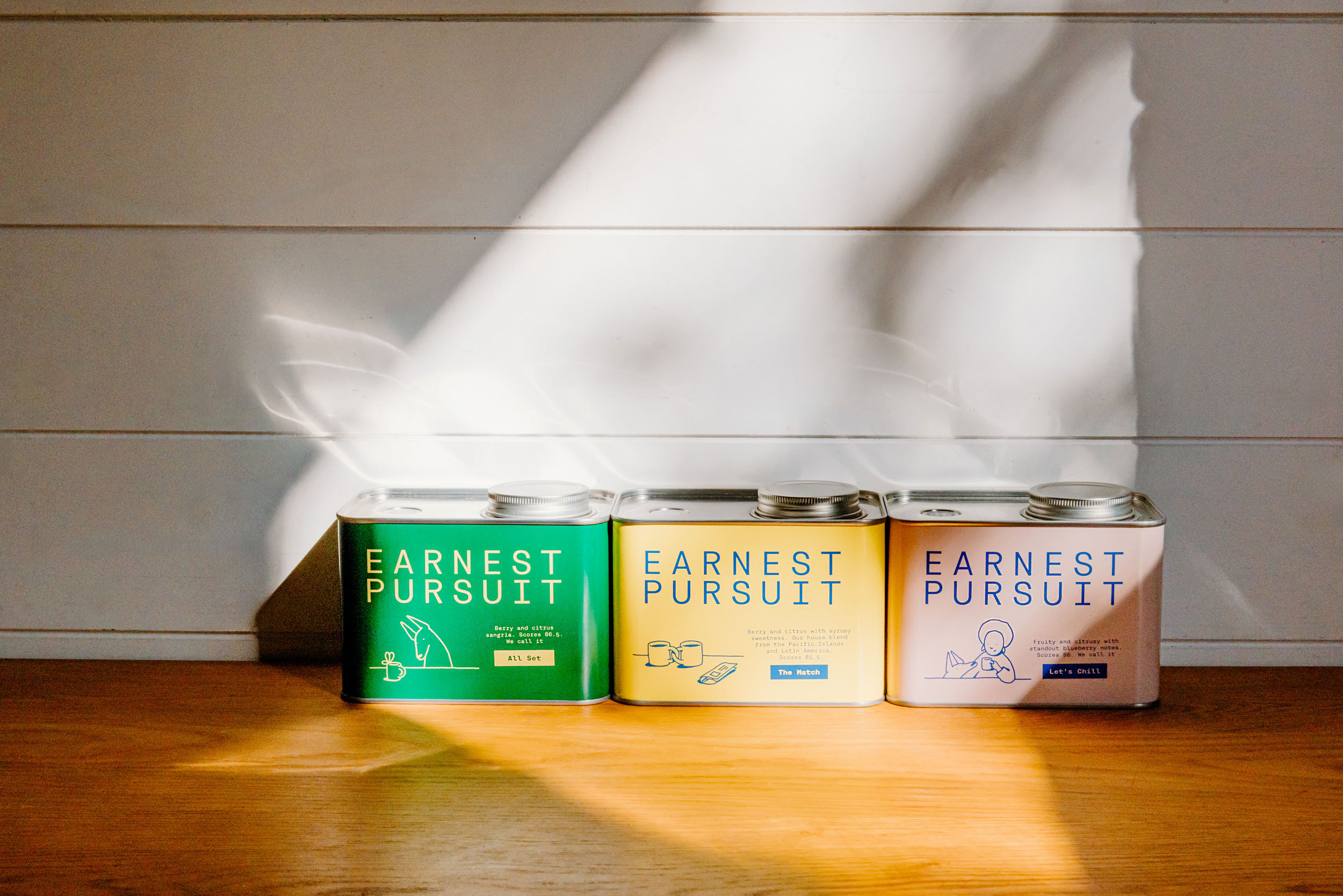
Adeline Artistry photographs three Earnest Pursuit tins in a row on a wood counter against white shiplap, a shaft of sunlight angling across the boards. Green "All Set", yellow "The Match" and peach "Let's Chill" each carry the wordmark, a character drawing and a tasting line, the yellow one reading "Berry and citrus with syrupy sweetness. Our house blend from the Pacific Islands and Latin America." Daylight warms the yellow toward cream and the peach toward pink, a reminder that printed color is only as stable as the window. The packaging design for all three is by Art of Packaging.
In a bright kitchen photographed by Adeline Artistry, a green corduroy Earnest Pursuit cap, a small line-drawn dog embroidered on one panel, hangs off the back of a white chair. On the table sit an open notebook with colored pencils laid across it and black coffee in a white cup and saucer; behind are white cabinets, exposed brick, a framed print and a small green package out of focus on the counter. The cap is the quietest application of the identity and arguably the most wearable, part of the merchandise a branding studio designed for the brand.

contact@
aofp.studio